
U.S. Federal Websites
Making navigating U.S. websites intuitive, modern, interconnected, and accessible for every age and background.
SECTIONS
01. Overview
02. Context & Problems
03. Research
04. Solution
05. Design
Work
About
Resume
Transforming U.S. federal websites for every age and background
Spring 2026 · Solo Project · Draft Concept · 2 weeks
“Visual Design is the Democratization of Knowledge”
Dr. Craig Vogel, 2019
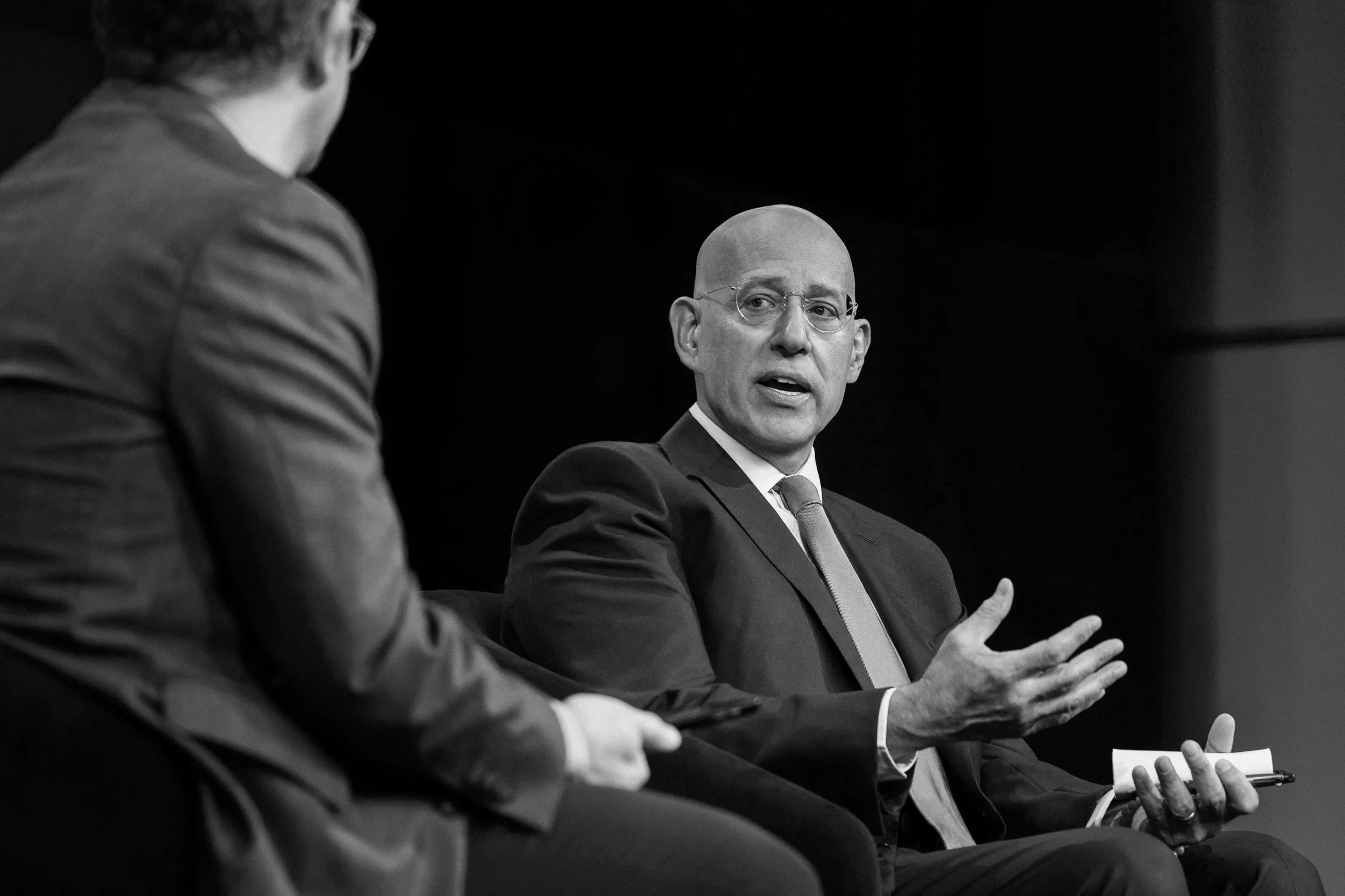
Bringing design to the forefront of government with the National Design Studio (NDS)
but not really...
On August 21st, 2025, the Trump Administration announced a new initiative, “America by Design,” facilitated by a new National Design Studio (NDS) and Chief Design Officer, to breathe “new life into the design of sites where people interface with their Government.”
The National Design Studio is a temporary solution derailed
The NDS sunsets in 2028. So far, they’ve launched visually-appealing sites like TrumpRX, Real Food, Safe DC, and Trump Card, but their work exposes a flawed design strategy, and signals how they intend to practice design if or when they draft improvements to the U.S. Web Design System (USWDS).
RealFood
TrumpRx
SafeDC
Problem No. 1
Aesthetics-first Mentality
Although a motion-heavy site can help with visual storytelling, too much of it can be a distraction from the information you’re trying to communicate and inhibit populations (including 28 million underserved by broadband) from receiving the care they deserve.
Problem No. 2
No Shared Identity
NDS has a “One Government” approach, aiming to make navigating federal websites like one cohesive experience. However, their current work feels fragmented, like a sandbox for campaign marketing.
Problem No. 3
Partisan Copywriting
NDS-built sites reflect the partisan language used by the Trump administration, signaling how NDS might plan to set copywriting guidelines for the USWDS – a system they now control by default, after the same administration dismantled 18F, USWDS’ original architects.
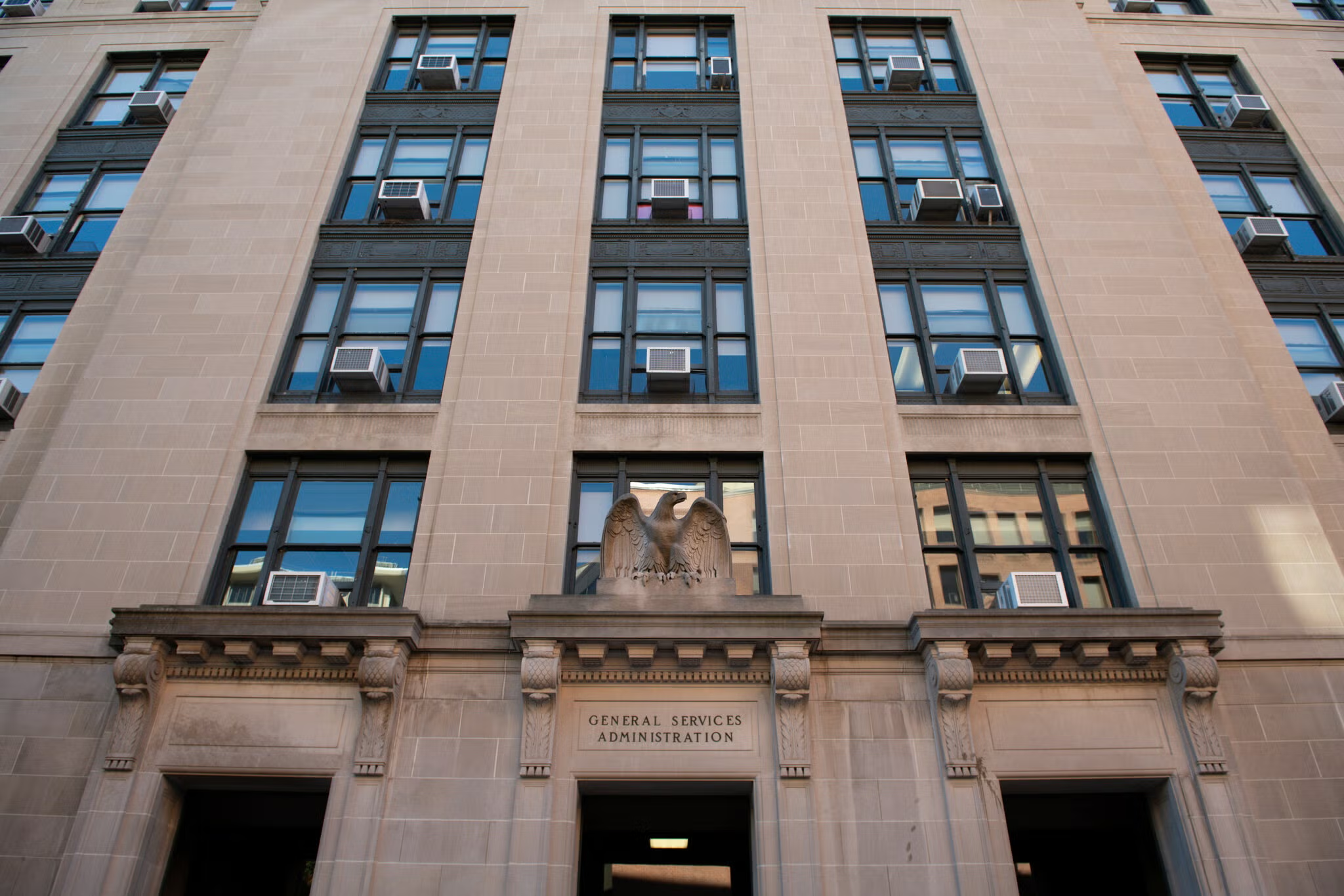
>90 layoffs and losing 12 years of 18F’s institutional knowledge
The Trump Administration’s DOGE eliminated 18F in 2025, an agency launched in 2014 that designed and developed products for government accessibility, resulting in a loss of technical expertise and 12 years of institutional knowledge.
How should a government website portray itself?
There are ~27,000 federal websites, with the most-visited including USPS.com, IRS.gov, SSA.gov, Studentaid.gov, USCIS.gov, and VA.gov. Each of these serve a specific goal but they all contribute to a broader digital experience for interacting with the U.S. government, requiring shared values.
01.
Unified in Visual Identity
Consistent layouts and user flows can help reduce friction and the learning curve when navigating across federal sites.
02.
Neutral and Understandable
Nonpartisan copywriting helps government build trust with people across different reading levels and political values.
03.
Official but Approachable
Government websites should clearly communicate official status balanced with a welcoming interface.
04.
Accessible
to All
Governments have a mandate to serve citizens and non-citizens regardless of their ability to navigate a website.
“Consistency is not necessarily conformity. Agencies, sites, and services may have different audiences, missions, and goals ... but we promote continuity by starting from shared solutions and values.”
The U.S. Web Design System’s Design Principles
Meeting users where they are.


Senior Citizen


New Resident


Young Adult
Bio
Joe is 74 and retired. He needs to manage his social security but isn’t familiar with computers.
Carla recently moved to the U.S. for work, looking for resources. English is her second language.
David is a 22-year-old college graduate looking for entry-level opportunities in the public sector.
Tech Skills
Very High (primarily mobile)
Low to Moderate (desktop)
Moderate to High (mobile and desktop)
Frustrations
He is overwhelmed by the number of resources and links presented on a single homepage
Government jargon that doesn't translate well and a lack of multi-language support.
Small font sizes, low-contrast text, and "hidden" contact information for human support.
Accessibility
Needs
Multi-language toggle and plain language summaries of complex tasks.
High contrast, screen-reader compatibility, and clear visual cues for navigation.
Three representative individuals who visit federal websites for very different reasons and face very different barriers. Here, I focus on improving the most-visited federal sites for the general public rather than NDS’s approach to create entirely new sites for a specific group.
Build a unified visual identity for federal websites that serves users across ages, backgrounds, and literacy levels, to democratize government knowledge?
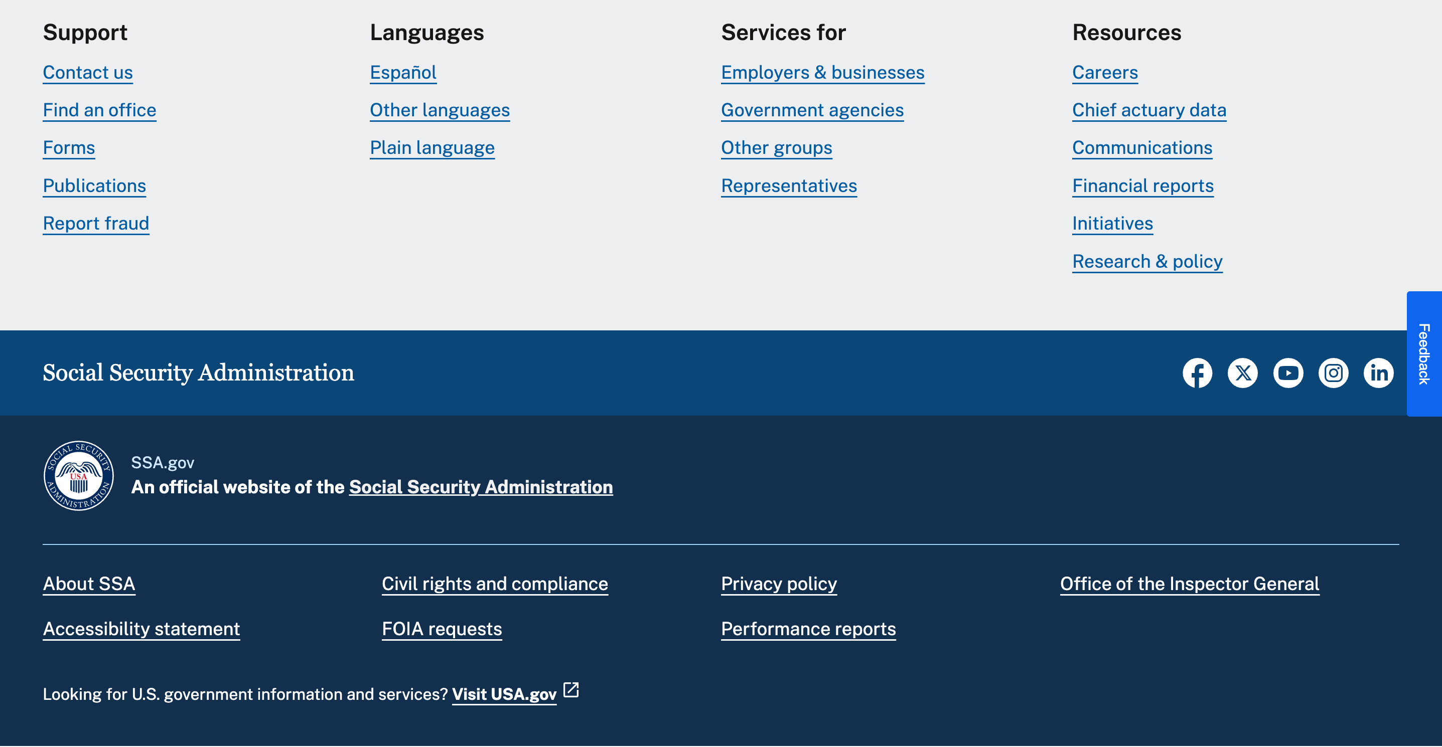
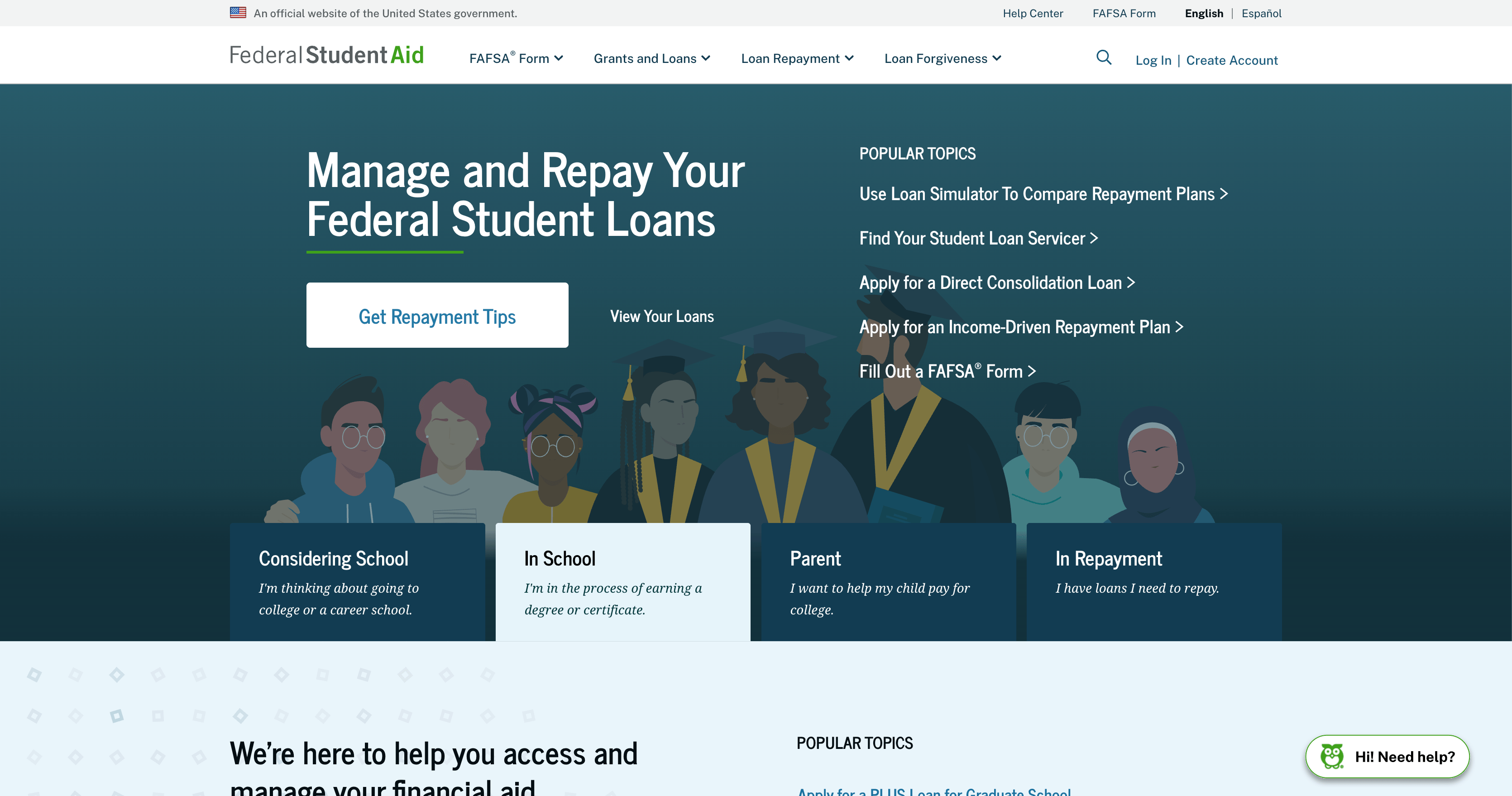
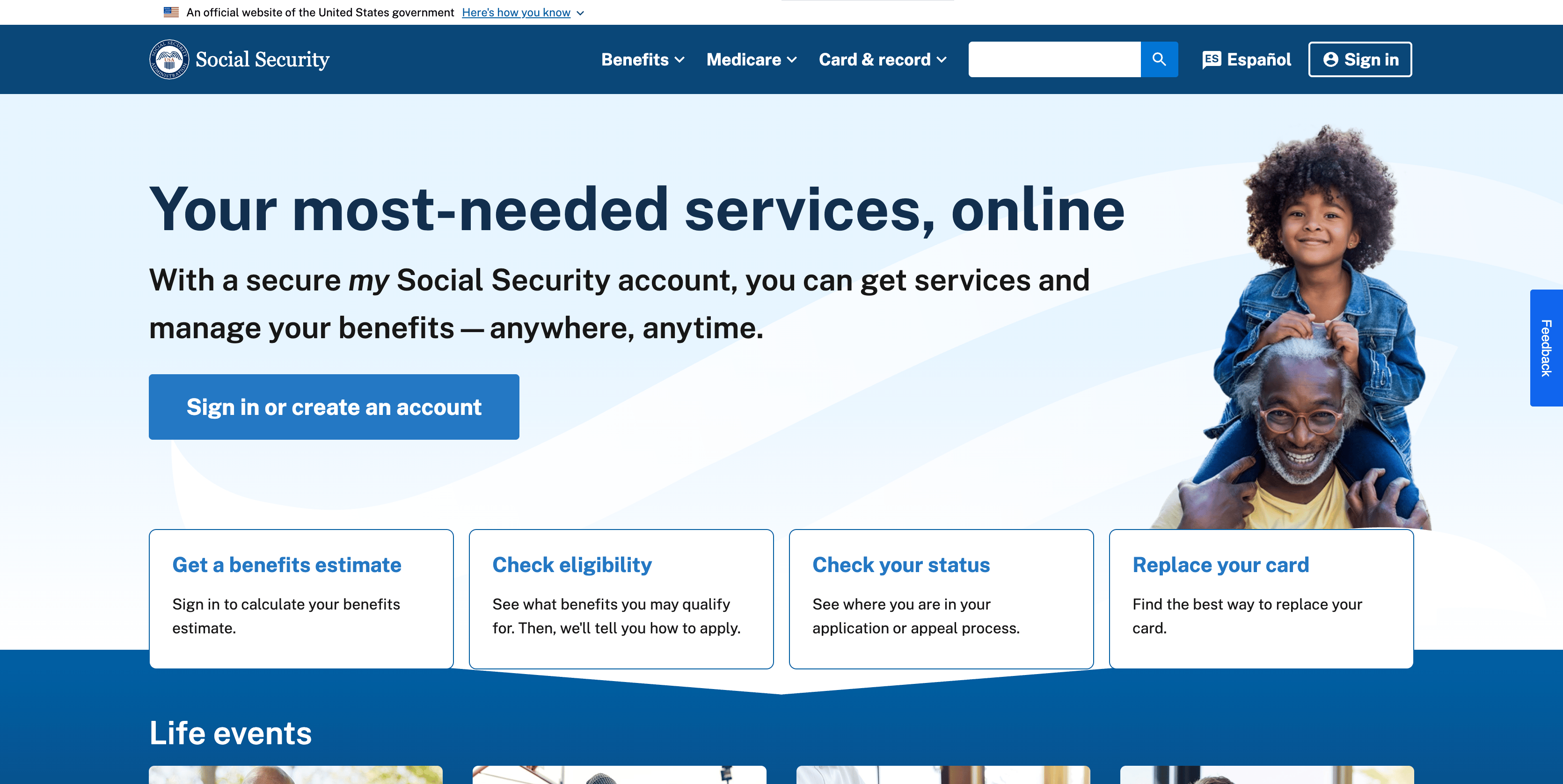
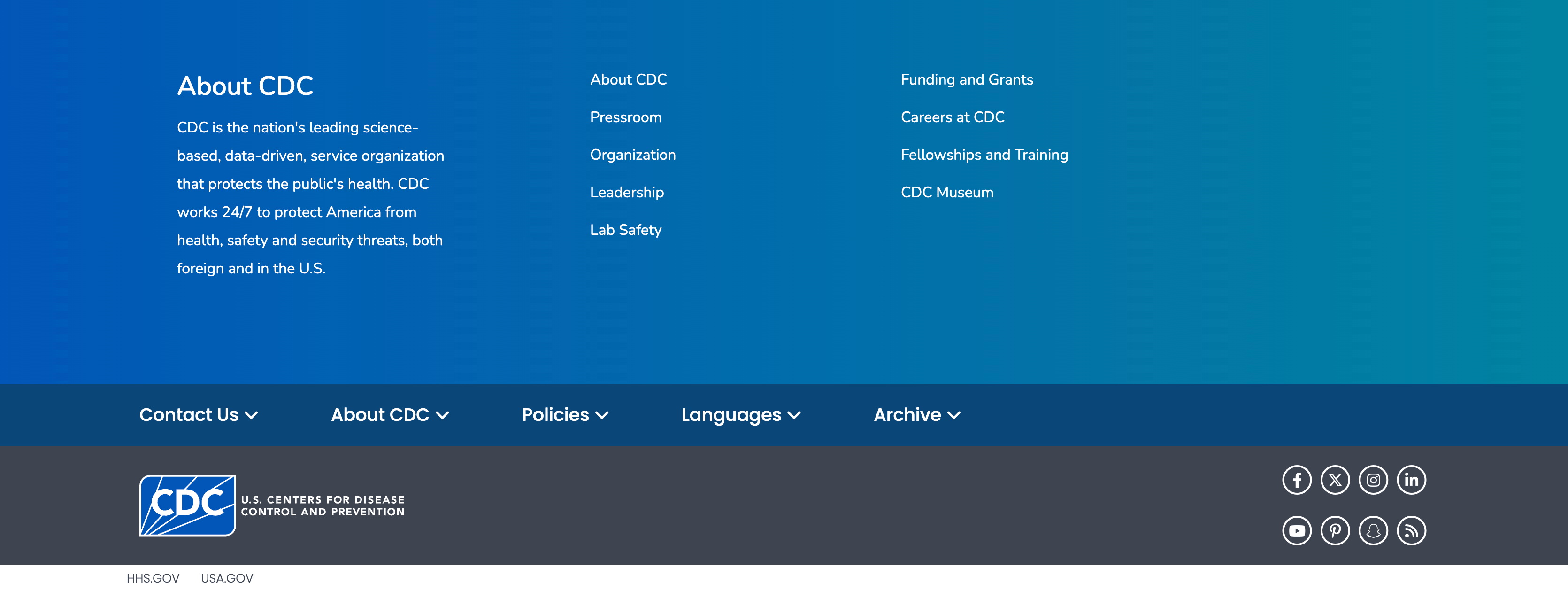
What federal homepages
have in common
U.S. Official Banners, a button to change site language, and quick links to most-visited pages are among the common elements that live in several federal sites’ homepages.
SSA
IRS
Student Aid
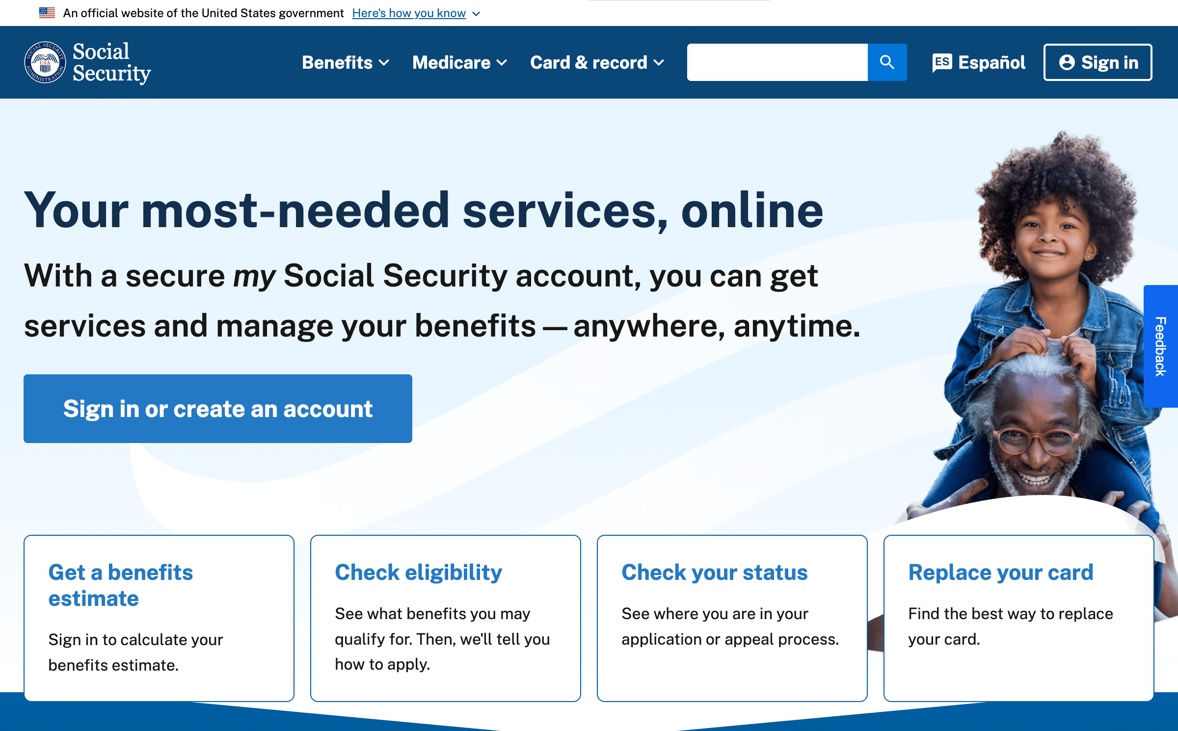
Adopting a user-first mentality for a more accessible, neutral and unified web experience.
A better approach to NDS’ “One Government” vision.
Before
After
Decision No. 1
Maintaining familiar patterns
Millions of users are already accustomed to the general layouts and hierarchy of information across homepages. I maintained those mental models.
Decision No. 2
Flexible component system
Government agencies have different needs to present information. Hero, banner, and footer variants (info-heavy vs. imagery-heavy; immersive banner fill vs. high contrast) allow flexibility without breaking the interconnected government identity
Decision No. 3
Beauty balanced with usability
Countering NDS’ big text and heavy motion approach, and the current federal sites’ choice overload, I stick to a light visual and content design to meet in the middle with different users.
Acknowledging the gaps and future iterations.
Here I mention a few major caveats about my designs that will be explored in future iterations. However, this case study highlights the problem with the National Design Studio, discusses how to design for government, and offers a new homepage as a starting point.
01.
Homepages aren’t the whole experience
The sheer scale of a design system for federal sites is not to be tackled alone. My homepage designs are just a start!
02.
Designed without USWDS’s foundation
Future iterations will be based on the research and guidelines provided by 18F and USWDS to back my design with research.
03.
Accessibility still needs a proper audit
Future iterations will involve testing federal law compliance, possibly explore APCA over WCAG, and testing typography.
04.
Desktop-first,
for now
Current prototypes are not responsive but is essential to ensure the user experience is fluid across any device.
Transforming U.S. federal websites for every age and background
Spring 2026 · Solo Project · Draft Concept · 2 weeks
“Visual Design is the Democratization of Knowledge”
Dr. Craig Vogel, 2019
Bringing design to the forefront of government with the National Design Studio (NDS)
but not really...
On August 21st, 2025, the Trump Administration announced a new initiative, “America by Design,” facilitated by a new National Design Studio (NDS) and Chief Design Officer, to breathe “new life into the design of sites where people interface with their Government.”
The National Design Studio is a temporary solution derailed
The NDS sunsets in 2028. So far, they’ve launched visually-appealing sites like TrumpRX, Real Food, Safe DC, and Trump Card, but their work exposes a flawed design strategy, and signals how they intend to practice design if or when they draft improvements to the U.S. Web Design System (USWDS).
RealFood
TrumpRx
SafeDC
TrumpCard
Problem No. 1
Aesthetics-first Mentality
Although a motion-heavy site can help with visual storytelling, too much of it can be a distraction from the information you’re trying to communicate and inhibit populations (including 28 million underserved by broadband) from receiving the care they deserve.
Problem No. 2
No Shared Identity
NDS has a “One Government” approach, aiming to make navigating federal websites like one cohesive experience. However, their current work feels fragmented, like a sandbox for campaign marketing.
Problem No. 3
Partisan Copywriting
NDS-built sites reflect the partisan language used by the Trump administration, signaling how NDS might plan to set copywriting guidelines for the USWDS – a system they now control by default, after the same administration dismantled 18F, USWDS’ original architects.
>90 layoffs and losing 12 years of 18F’s institutional knowledge
The Trump Administration’s DOGE eliminated 18F in 2025, an agency launched in 2014 that designed and developed products for government accessibility, resulting in a loss of technical expertise and 12 years of institutional knowledge.
How should a government website portray itself?
There are ~27,000 federal websites, with the most-visited including USPS.com, IRS.gov, SSA.gov, Studentaid.gov, USCIS.gov, and VA.gov. Each of these serve a specific goal but they all contribute to a broader digital experience for interacting with the U.S. government, requiring shared values.
01.
Unified in Visual Identity
Consistent layouts and user flows can help reduce friction and the learning curve when navigating across federal sites.
02.
Neutral and Understandable
Nonpartisan copywriting helps government build trust with people across different reading levels and political values.
03.
Official but Approachable
Government websites should clearly communicate official status balanced with a welcoming interface.
04.
Accessible
to All
Governments have a mandate to serve citizens and non-citizens regardless of their ability to navigate a website.
“Consistency is not necessarily conformity. Agencies, sites, and services may have different audiences, missions, and goals ... but we promote continuity by starting from shared solutions and values.”
The U.S. Web Design System’s Design Principles
Meeting users where they are.
Senior Citizen
New Resident
Young Adult
Joe is 74 and retired. He needs to manage his social security but isn’t familiar with computers.
Bio
David is a 22-year-old college graduate looking for entry-level opportunities in the public sector.
Carla recently moved to the U.S. for work, looking for resources. English is her second language.
Tech Skills
Low to Moderate (desktop)
Moderate to High (mobile and desktop)
Very High (primarily mobile)
Frustrations
Small font sizes, low-contrast text, and "hidden" contact information for human support.
Government jargon that doesn't translate well and a lack of multi-language support.
He is overwhelmed by the number of resources and links presented on a single homepage
Accessibility
Needs
High contrast, screen-reader compatibility, and clear visual cues for navigation.
Multi-language toggle and plain language summaries of complex tasks.
Three representative individuals who visit federal websites for very different reasons and face very different barriers. Here, I focus on improving the most-visited federal sites for the general public rather than NDS’s approach to create entirely new sites for a specific group.
Build a unified visual identity for federal websites that serves users across ages, backgrounds, and literacy levels, to democratize government knowledge?
What federal homepages
have in common
U.S. Official Banners, a button to change site language, and quick links to most-visited pages are among the common elements that live in several federal sites’ homepages.
SSA
IRS
Student Aid
Adopting a user-first mentality for a more accessible, neutral and unified web experience.
A better approach to NDS’ “One Government” vision.
Before
After
Side-by-side
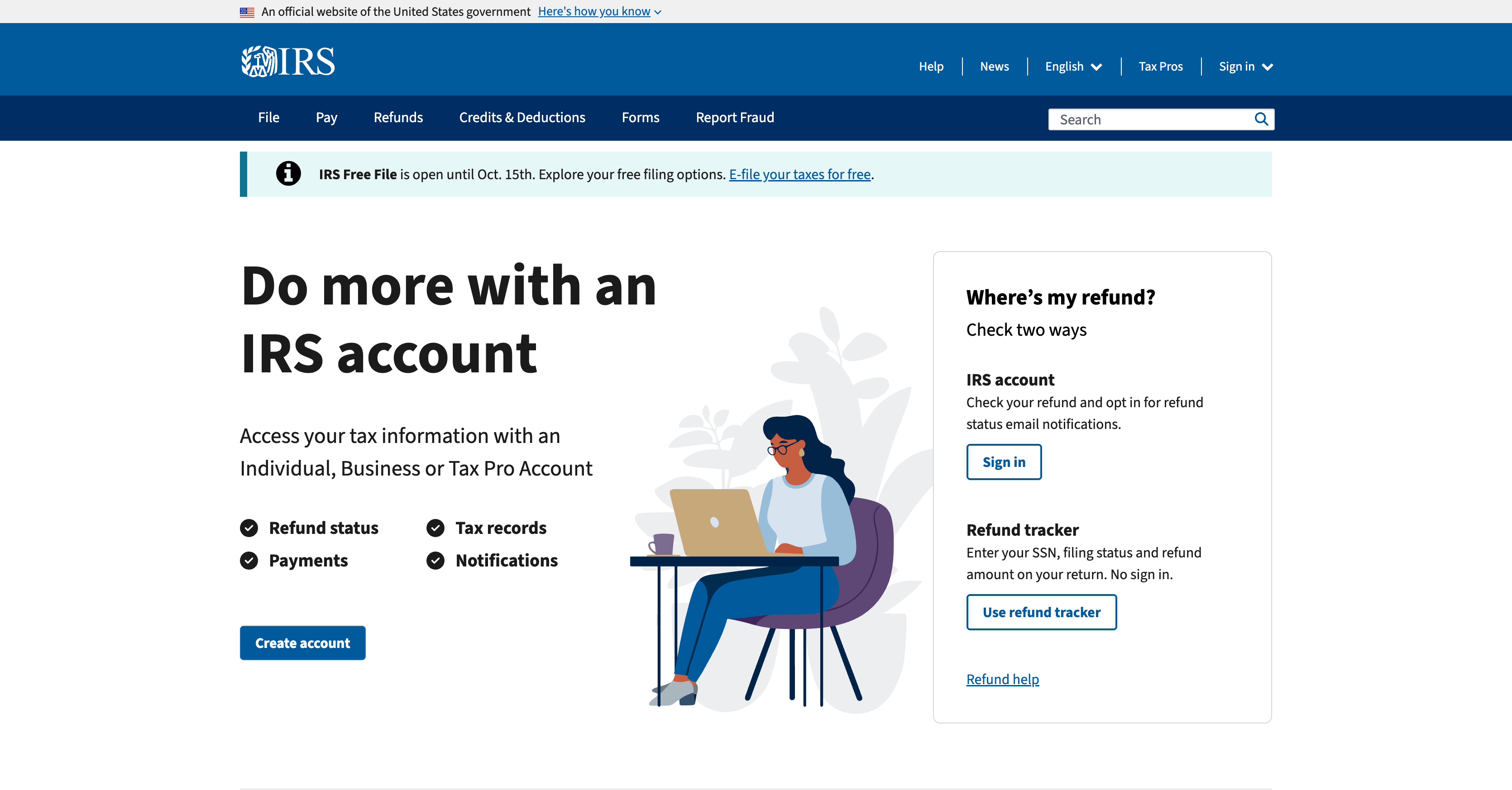
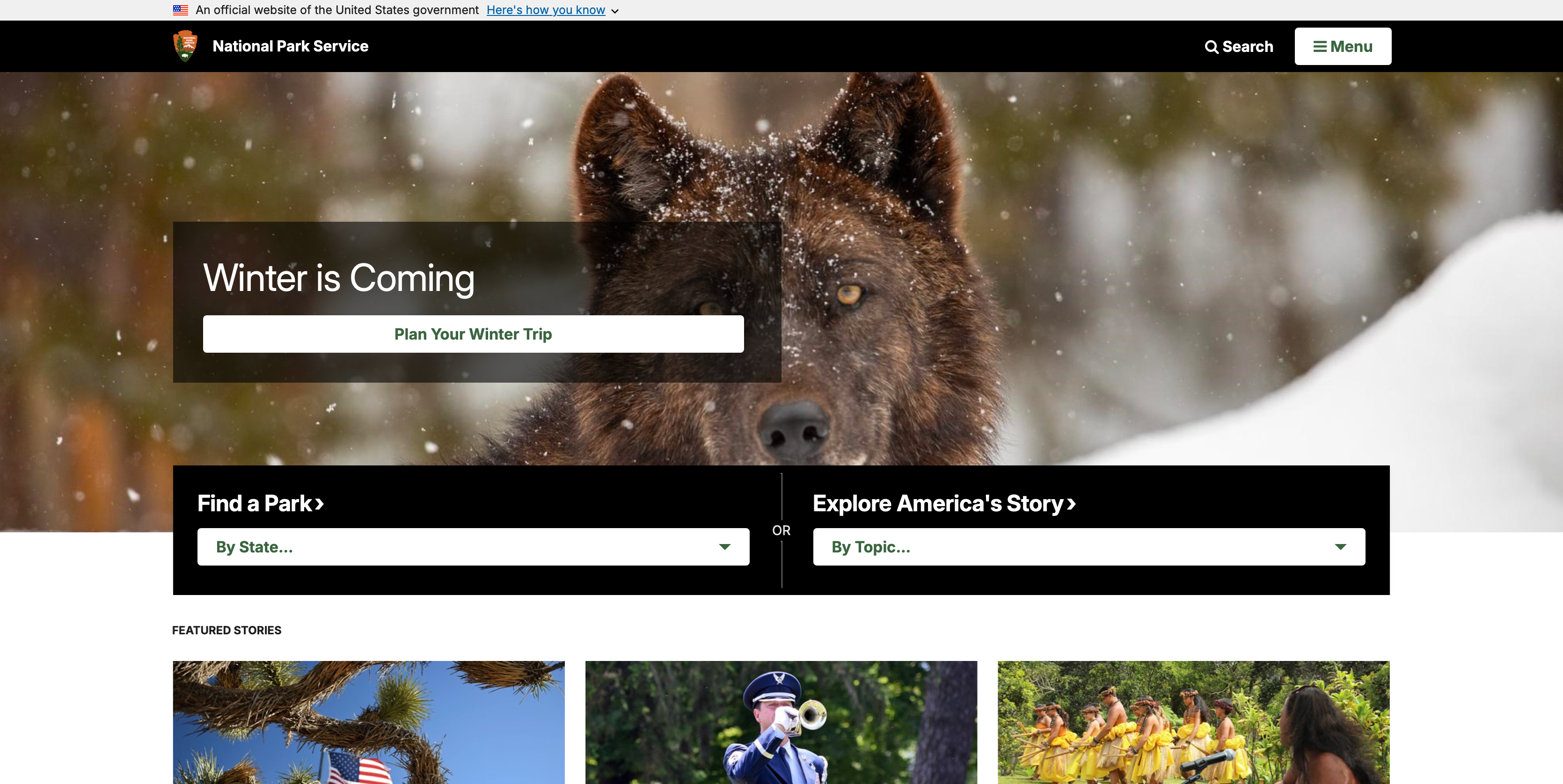
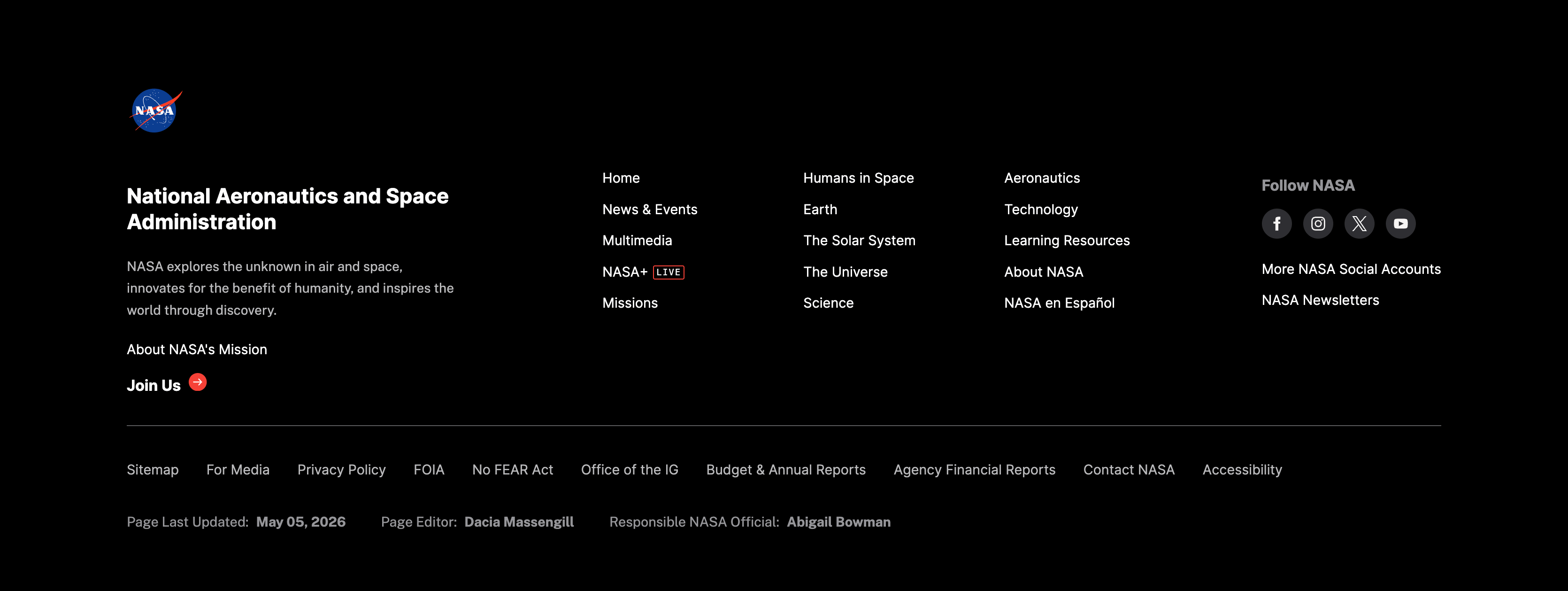
Decision No. 1
Maintaining familiar patterns
Millions of users are already accustomed to the general layouts and hierarchy of information across homepages. I maintained those mental models.
Decision No. 2
Flexible component system
Government agencies have different needs to present information. Hero, banner, and footer variants (info-heavy vs. imagery-heavy; immersive banner fill vs. high contrast) allow flexibility without breaking the interconnected government identity
Decision No. 3
Beauty balanced with usability
Countering NDS’ big text and heavy motion approach, and the current federal sites’ choice overload, I stick to a light visual and content design to meet in the middle with different users.
Here I mention a few major caveats about my designs that will be explored in future iterations. However, this case study highlights the problem with the National Design Studio, discusses how to design for government, and offers a new homepage as a starting point.
Acknowledging the gaps and future iterations.
01.
Homepages aren’t the whole experience
The sheer scale of a design system for federal sites is not to be tackled alone. My homepage designs are just a start!
02.
Designed without USWDS’s foundation
Future iterations will be based on the research and guidelines provided by 18F and USWDS to back my design with research.
03.
Accessibility still needs a proper audit
Future iterations will involve testing federal law compliance, possibly explore APCA over WCAG, and testing typography.
04.
Desktop-first,
for now
Current prototypes are not responsive but is essential to ensure the user experience is fluid across any device.
SECTIONS
01. Overview
02. Context & Problems
03. Research
04. Solution
05. Design
Work
About
Resume
Transforming U.S. federal websites for every age and background
Spring 2026 · Solo Project · Draft Concept · 2 weeks
“Visual Design is the Democratization of Knowledge”
Dr. Craig Vogel, 2019
On August 21st, 2025, the Trump Administration announced a new initiative, “America by Design,” facilitated by a new National Design Studio (NDS) and Chief Design Officer, to breathe “new life into the design of sites where people interface with their Government.”
Bringing design to the forefront of government with the National Design Studio (NDS)
but not really...
The National Design Studio is a temporary solution derailed
The NDS sunsets in 2028. So far, they’ve launched visually-appealing sites like TrumpRX, Real Food, Safe DC, and Trump Card, but their work exposes a flawed design strategy, and signals how they intend to practice design if or when they draft improvements to the U.S. Web Design System (USWDS).
RealFood
TrumpRx
SafeDC
TrumpCard
Problem No. 1
Aesthetics-first Mentality
Although a motion-heavy site can help with visual storytelling, too much of it can be a distraction from the information you’re trying to communicate and inhibit populations (including 28 million underserved by broadband) from receiving the care they deserve.
Problem No. 2
No Shared Identity
NDS has a “One Government” approach, aiming to make navigating federal websites like one cohesive experience. However, their current work feels fragmented, like a sandbox for campaign marketing.
Problem No. 3
Partisan Copywriting
NDS-built sites reflect the partisan language used by the Trump administration, signaling how NDS might plan to set copywriting guidelines for the USWDS – a system they now control by default, after the same administration dismantled 18F, USWDS’ original architects.
The Trump Administration’s DOGE eliminated 18F in 2025, an agency launched in 2014 that designed and developed products for government accessibility, resulting in a loss of technical expertise and 12 years of institutional knowledge.
>90 layoffs and losing 12 years of 18F’s institutional knowledge
How should a government website portray itself?
There are ~27,000 federal websites, with the most-visited including USPS.com, IRS.gov, SSA.gov, Studentaid.gov, USCIS.gov, and VA.gov. Each of these serve a specific goal but they all contribute to a broader digital experience for interacting with the U.S. government, requiring shared values.
01.
Unified in Visual Identity
Consistent layouts and user flows can help reduce friction and the learning curve when navigating across federal sites.
02.
Neutral and Understandable
Nonpartisan copywriting helps government build trust with people across different reading levels and political values.
03.
Official but Approachable
Government websites should clearly communicate official status balanced with a welcoming interface.
04.
Accessible
to All
Governments have a mandate to serve citizens and non-citizens regardless of their ability to navigate a website.
“Consistency is not necessarily conformity. Agencies, sites, and services may have different audiences, missions, and goals ... but we promote continuity by starting from shared solutions and values.”
The U.S. Web Design System’s Design Principles
Meeting users where they are.
Senior Citizen
New Resident
Young Adult
Joe is 74 and retired. He needs to manage his social security but isn’t familiar with computers.
Bio
David is a 22-year-old college graduate looking for entry-level opportunities in the public sector.
Carla recently moved to the U.S. for work, looking for resources. English is her second language.
Tech Skills
Low to Moderate (desktop)
Moderate to High (mobile and desktop)
Very High (primarily mobile)
Frustrations
Small font sizes, low-contrast text, and "hidden" contact information for human support.
Government jargon that doesn't translate well and a lack of multi-language support.
He is overwhelmed by the number of resources and links presented on a single homepage
Accessibility
Needs
High contrast, screen-reader compatibility, and clear visual cues for navigation.
Multi-language toggle and plain language summaries of complex tasks.
Three representative individuals who visit federal websites for very different reasons and face very different barriers. Here, I focus on improving the most-visited federal sites for the general public rather than NDS’s approach to create entirely new sites for a specific group.
Build a unified visual identity for federal websites that serves users across ages, backgrounds, and literacy levels, to democratize government knowledge?

U.S. Official
Banner
Hero with
Call to Action
What federal homepages
have in common
Identifying patters in the most-visited federal sites is a starting point to discovering how government agencies communicate information to users and what to prioritize.
SSA
IRS
Student Aid
Quick links
to popular
pages
Change site
language
Site Links
Logo
Socials
Adopting a user-first mentality for a more accessible, neutral and unified web experience.
A better approach to NDS’ “One Government” vision.
Before
After
Side-by-side
Decision No. 1
Maintaining familiar patterns
Millions of users are already accustomed to the general layouts and hierarchy of information across homepages. I maintained those mental models.
Decision No. 2
Flexible component system
Government agencies have different needs to present information. Hero, banner, and footer variants (info-heavy vs. imagery-heavy; immersive banner fill vs. high contrast) allow flexibility without breaking the interconnected government identity
Decision No. 3
Beauty balanced with usability
Countering NDS’ big text and heavy motion approach, and the current federal sites’ choice overload, I stick to a light visual and content design to meet in the middle with different users.
Acknowledging the gaps and future iterations.
Here I mention a few major caveats about my designs that will be explored in future iterations. However, this case study highlights the problem with the National Design Studio, discusses how to design for government, and offers a new homepage as a starting point.
01.
Homepages aren’t the whole experience
The sheer scale of a design system for federal sites is not to be tackled alone. My homepage designs are just a start!
02.
Designed without USWDS’s foundation
Future iterations will be based on the research and guidelines provided by 18F and USWDS to back my design with research.
03.
Accessibility still needs a proper audit
Future iterations will involve testing federal law compliance, possibly explore APCA over WCAG, and testing typography.
04.
Desktop-first,
for now
Current prototypes are not responsive but is essential to ensure the user experience is fluid across any device.
SECTIONS
01. Overview
02. Context & Problems
03. Research
04. Solution
05. Design
Work
About
Resume
U.S. Federal Websites
Making navigating U.S. websites intuitive, modern, interconnected, and accessible for every age and background.
SECTIONS
01. Overview
02. Context & Problems
03. Research
04. Solution
05. Design
Work
About
Resume
Transforming U.S. federal websites for every age and background
Spring 2026 · Solo Project · Draft Concept · 2 weeks
“Visual Design is the Democratization of Knowledge”
Dr. Craig Vogel, 2019
On August 21st, 2025, the Trump Administration announced a new initiative, “America by Design,” facilitated by a new National Design Studio (NDS) and Chief Design Officer, to breathe “new life into the design of sites where people interface with their Government.”
Bringing design to the forefront of government with the National Design Studio (NDS)
but not really...
The National Design Studio is a temporary solution derailed
The NDS sunsets in 2028. So far, they’ve launched visually-appealing sites like TrumpRX, Real Food, Safe DC, and Trump Card, but their work exposes a flawed design strategy, and signals how they intend to practice design if or when they draft improvements to the U.S. Web Design System (USWDS).
RealFood
TrumpRx
SafeDC
TrumpCard
Problem No. 1
Aesthetics-first Mentality
Although a motion-heavy site can help with visual storytelling, too much of it can be a distraction from the information you’re trying to communicate and inhibit populations (including 28 million underserved by broadband) from receiving the care they deserve.
Problem No. 2
No Shared Identity
NDS has a “One Government” approach, aiming to make navigating federal websites like one cohesive experience. However, their current work feels fragmented, like a sandbox for campaign marketing.
Problem No. 3
Partisan Copywriting
NDS-built sites reflect the partisan language used by the Trump administration, signaling how NDS might plan to set copywriting guidelines for the USWDS – a system they now control by default, after the same administration dismantled 18F, USWDS’ original architects.
The Trump Administration’s DOGE eliminated 18F in 2025, an agency launched in 2014 that designed and developed products for government accessibility, resulting in a loss of technical expertise and 12 years of institutional knowledge.
>90 layoffs and losing 12 years of 18F’s institutional knowledge
How should a government website portray itself?
There are ~27,000 federal websites, with the most-visited including USPS.com, IRS.gov, SSA.gov, Studentaid.gov, USCIS.gov, and VA.gov. Each of these serve a specific goal but they all contribute to a broader digital experience for interacting with the U.S. government, requiring shared values.
01.
Unified in Visual Identity
Consistent layouts and user flows can help reduce friction and the learning curve when navigating across federal sites.
02.
Neutral and Understandable
Nonpartisan copywriting helps government build trust with people across different reading levels and political values.
03.
Official but Approachable
Government websites should clearly communicate official status balanced with a welcoming interface.
04.
Accessible
to All
Governments have a mandate to serve citizens and non-citizens regardless of their ability to navigate a website.
“Consistency is not necessarily conformity. Agencies, sites, and services may have different audiences, missions, and goals ... but we promote continuity by starting from shared solutions and values.”
The U.S. Web Design System’s Design Principles
Meeting users where they are.
Senior Citizen
New Resident
Young Adult
Joe is 74 and retired. He needs to manage his social security but isn’t familiar with computers.
Bio
David is a 22-year-old college graduate looking for entry-level opportunities in the public sector.
Carla recently moved to the U.S. for work, looking for resources. English is her second language.
Tech Skills
Low to Moderate (desktop)
Moderate to High (mobile and desktop)
Very High (primarily mobile)
Frustrations
Small font sizes, low-contrast text, and "hidden" contact information for human support.
Government jargon that doesn't translate well and a lack of multi-language support.
He is overwhelmed by the number of resources and links presented on a single homepage
Accessibility
Needs
High contrast, screen-reader compatibility, and clear visual cues for navigation.
Multi-language toggle and plain language summaries of complex tasks.
Three representative individuals who visit federal websites for very different reasons and face very different barriers. Here, I focus on improving the most-visited federal sites for the general public rather than NDS’s approach to create entirely new sites for a specific group.
Build a unified visual identity for federal websites that serves users across ages, backgrounds, and literacy levels, to democratize government knowledge?
U.S. Official
Banner
Hero with
Call to Action
What federal homepages
have in common
Identifying patters in the most-visited federal sites is a starting point to discovering how government agencies communicate information to users and what to prioritize.
SSA
IRS
Student Aid
Quick links
to popular
pages
Change site
language
Site Links
Logo
Socials
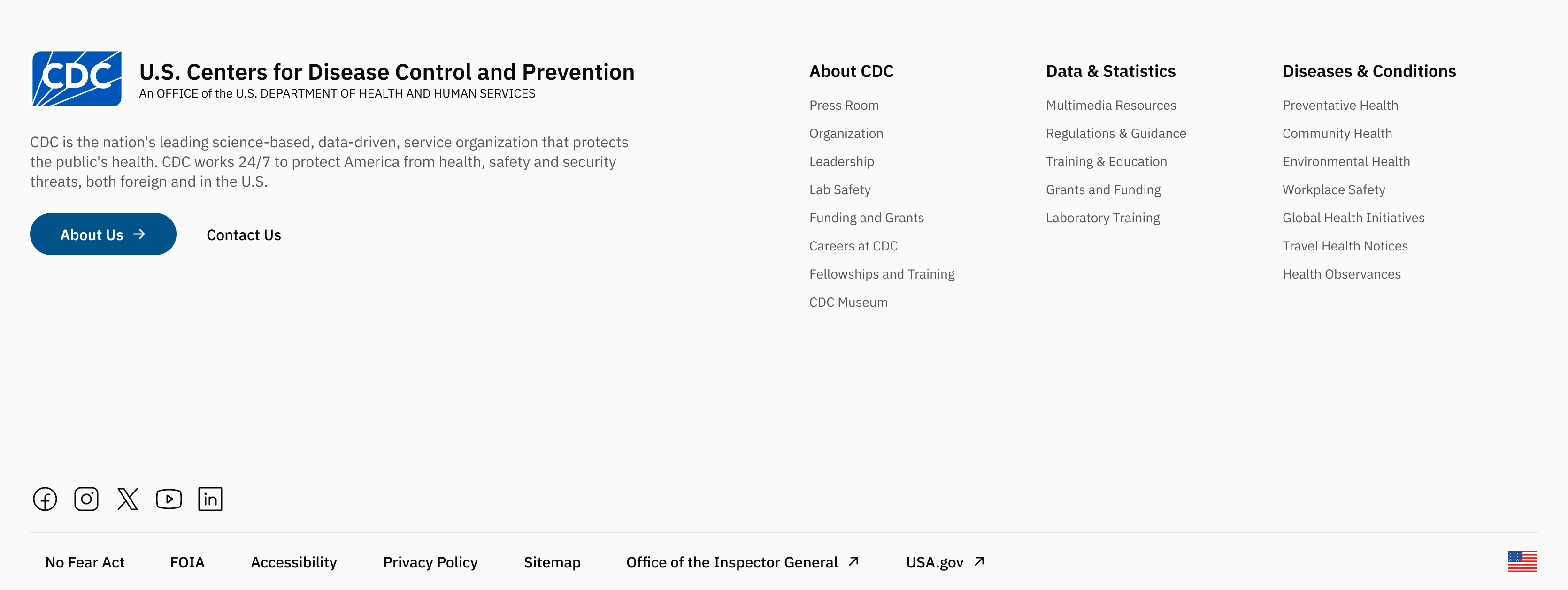
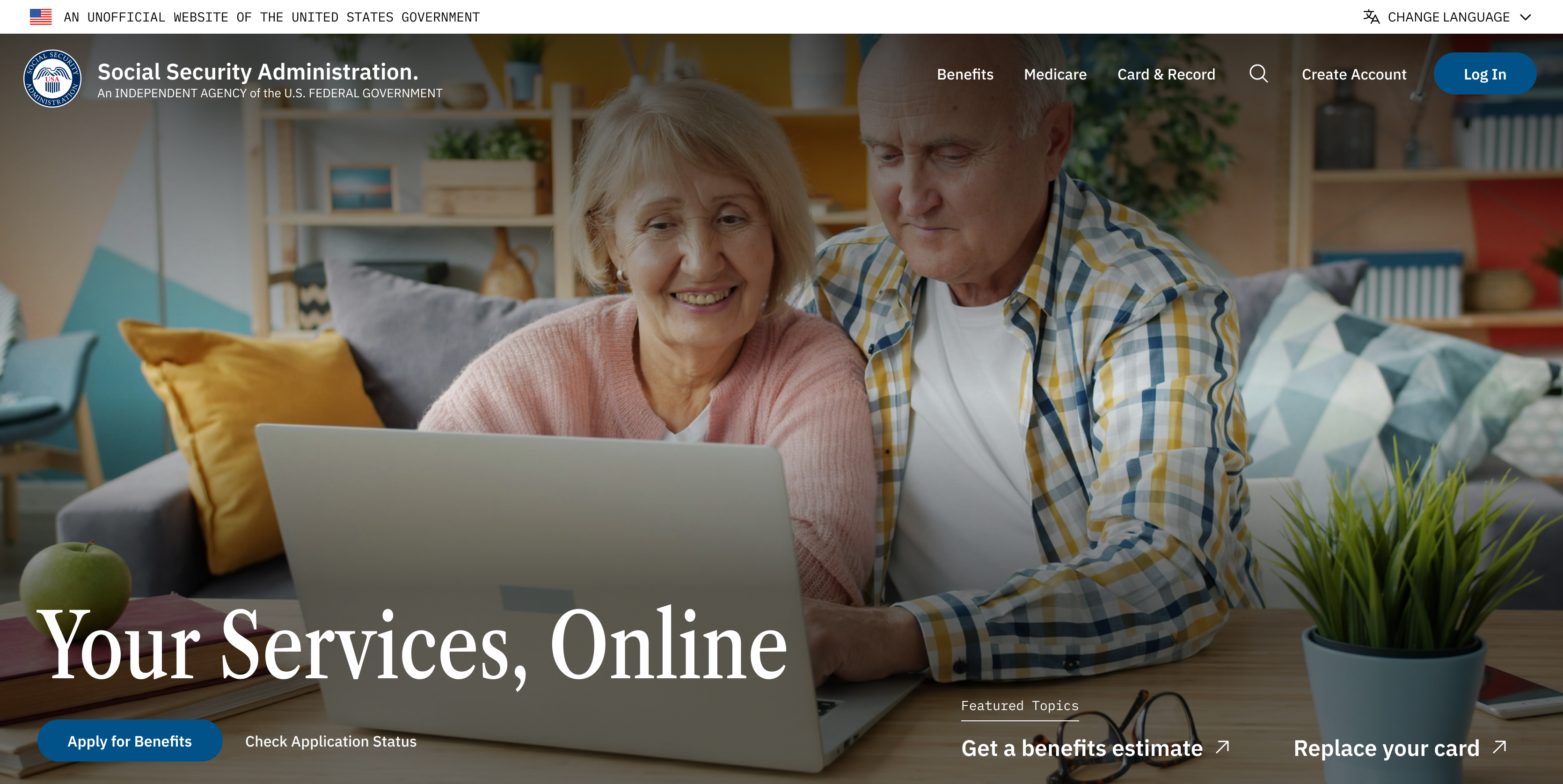
Adopting a user-first mentality for a more accessible, neutral and unified web experience.
A better approach to NDS’ “One Government” vision.
Before
After
Side-by-side
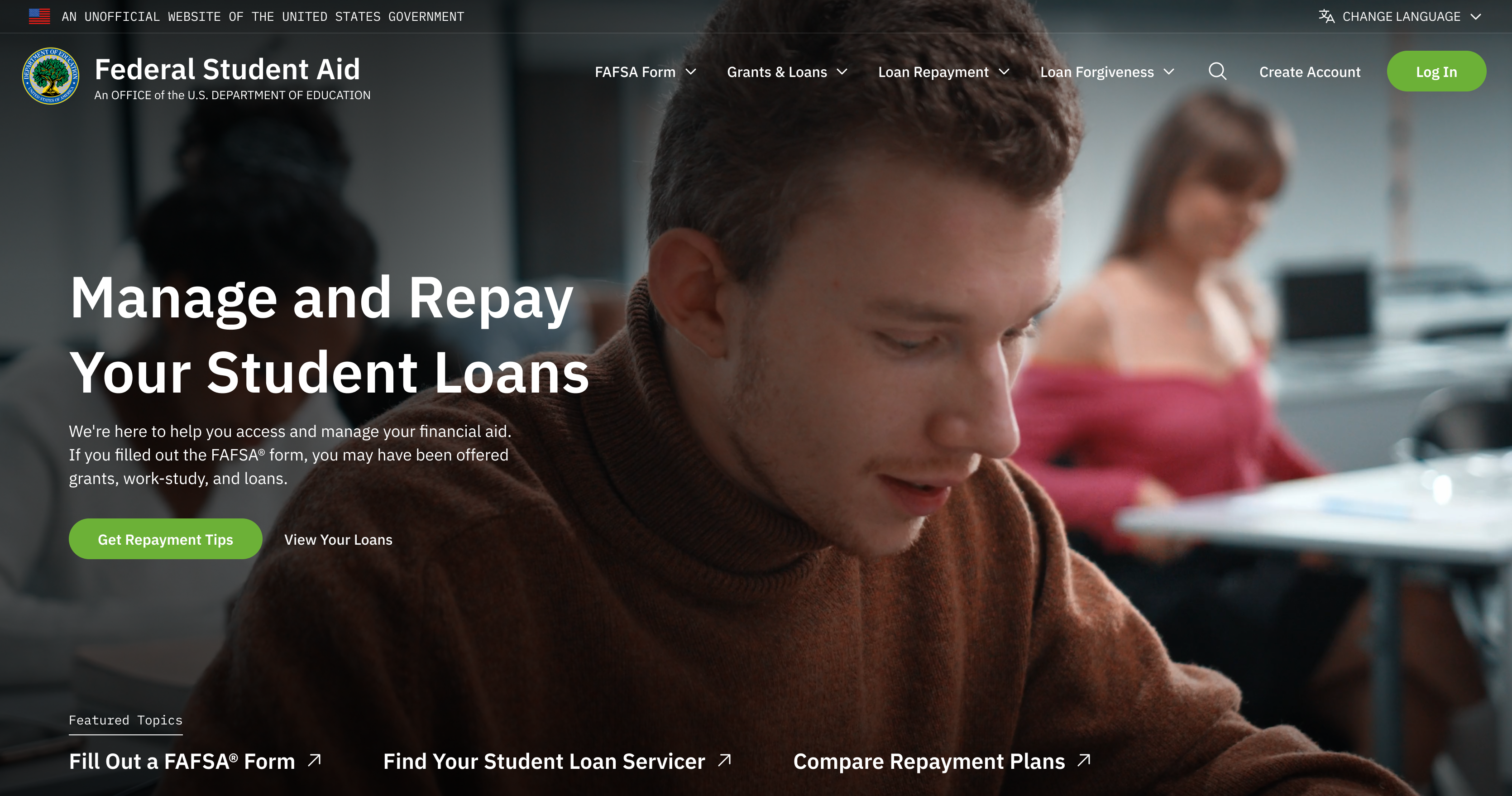
Decision No. 1
Maintaining familiar patterns
Millions of users are already accustomed to the general layouts and hierarchy of information across homepages. I maintained those mental models.
Decision No. 2
Flexible component system
Government agencies have different needs to present information. Hero, banner, and footer variants (info-heavy vs. imagery-heavy; immersive banner fill vs. high contrast) allow flexibility without breaking the interconnected government identity
Decision No. 3
Beauty balanced with usability
Countering NDS’ big text and heavy motion approach, and the current federal sites’ choice overload, I stick to a light visual and content design to meet in the middle with different users.
Acknowledging the gaps and future iterations.
Here I mention a few major caveats about my designs that will be explored in future iterations. However, this case study highlights the problem with the National Design Studio, discusses how to design for government, and offers a new homepage as a starting point.
01.
Homepages aren’t the whole experience
The sheer scale of a design system for federal sites is not to be tackled alone. My homepage designs are just a start!
02.
Designed without USWDS’s foundation
Future iterations will be based on the research and guidelines provided by 18F and USWDS to back my design with research.
03.
Accessibility still needs a proper audit
Future iterations will involve testing federal law compliance, possibly explore APCA over WCAG, and testing typography.
04.
Desktop-first,
for now
Current prototypes are not responsive but is essential to ensure the user experience is fluid across any device.
U.S. Federal Websites
Making navigating U.S. websites intuitive, modern, interconnected, and accessible for every age and background.
SECTIONS
01. Overview
02. Context & Problems
03. Research
04. Solution
05. Design
Work
About
Resume
Transforming U.S. federal websites for every age and background
Spring 2026 · Solo Project · Draft Concept · 2 weeks
“Visual Design is the Democratization of Knowledge”
Dr. Craig Vogel, 2019
On August 21st, 2025, the Trump Administration announced a new initiative, “America by Design,” facilitated by a new National Design Studio (NDS) and Chief Design Officer, to breathe “new life into the design of sites where people interface with their Government.”
Bringing design to the forefront of government with the National Design Studio (NDS)
but not really...
The National Design Studio is a temporary solution derailed
The NDS sunsets in 2028. So far, they’ve launched visually-appealing sites like TrumpRX, Real Food, Safe DC, and Trump Card, but their work exposes a flawed design strategy, and signals how they intend to practice design if or when they draft improvements to the U.S. Web Design System (USWDS).
RealFood
TrumpRx
SafeDC
TrumpCard
Problem No. 1
Aesthetics-first Mentality
Although a motion-heavy site can help with visual storytelling, too much of it can be a distraction from the information you’re trying to communicate and inhibit populations (including 28 million underserved by broadband) from receiving the care they deserve.
Problem No. 2
No Shared Identity
NDS has a “One Government” approach, aiming to make navigating federal websites like one cohesive experience. However, their current work feels fragmented, like a sandbox for campaign marketing.
Problem No. 3
Partisan Copywriting
NDS-built sites reflect the partisan language used by the Trump administration, signaling how NDS might plan to set copywriting guidelines for the USWDS – a system they now control by default, after the same administration dismantled 18F, USWDS’ original architects.
The Trump Administration’s DOGE eliminated 18F in 2025, an agency launched in 2014 that designed and developed products for government accessibility, resulting in a loss of technical expertise and 12 years of institutional knowledge.
>90 layoffs and losing 12 years of 18F’s institutional knowledge
How should a government website portray itself?
There are ~27,000 federal websites, with the most-visited including USPS.com, IRS.gov, SSA.gov, Studentaid.gov, USCIS.gov, and VA.gov. Each of these serve a specific goal but they all contribute to a broader digital experience for interacting with the U.S. government, requiring shared values.
01.
Unified in Visual Identity
Consistent layouts and user flows can help reduce friction and the learning curve when navigating across federal sites.
02.
Neutral and Understandable
Nonpartisan copywriting helps government build trust with people across different reading levels and political values.
03.
Official but Approachable
Government websites should clearly communicate official status balanced with a welcoming interface.
04.
Accessible
to All
Governments have a mandate to serve citizens and non-citizens regardless of their ability to navigate a website.
“Consistency is not necessarily conformity. Agencies, sites, and services may have different audiences, missions, and goals ... but we promote continuity by starting from shared solutions and values.”
The U.S. Web Design System’s Design Principles
Meeting users where they are.
Senior Citizen
New Resident
Young Adult
Joe is 74 and retired. He needs to manage his social security but isn’t familiar with computers.
Bio
David is a 22-year-old college graduate looking for entry-level opportunities in the public sector.
Carla recently moved to the U.S. for work, looking for resources. English is her second language.
Tech Skills
Low to Moderate (desktop)
Moderate to High (mobile and desktop)
Very High (primarily mobile)
Frustrations
Small font sizes, low-contrast text, and "hidden" contact information for human support.
Government jargon that doesn't translate well and a lack of multi-language support.
He is overwhelmed by the number of resources and links presented on a single homepage
Accessibility
Needs
High contrast, screen-reader compatibility, and clear visual cues for navigation.
Multi-language toggle and plain language summaries of complex tasks.
Three representative individuals who visit federal websites for very different reasons and face very different barriers. Here, I focus on improving the most-visited federal sites for the general public rather than NDS’s approach to create entirely new sites for a specific group.
Build a unified visual identity for federal websites that serves users across ages, backgrounds, and literacy levels, to democratize government knowledge?
U.S. Official
Banner
Hero with
Call to Action
What federal homepages
have in common
Identifying patters in the most-visited federal sites is a starting point to discovering how government agencies communicate information to users and what to prioritize.
SSA
IRS
Student Aid
Quick links
to popular
pages
Change site
language
Site Links
Logo
Socials
Adopting a user-first mentality for a more accessible, neutral and unified web experience.
A better approach to NDS’ “One Government” vision.
Before
After
Side-by-side
Decision No. 1
Maintaining familiar patterns
Millions of users are already accustomed to the general layouts and hierarchy of information across homepages. I maintained those mental models.
Decision No. 2
Flexible component system
Government agencies have different needs to present information. Hero, banner, and footer variants (info-heavy vs. imagery-heavy; immersive banner fill vs. high contrast) allow flexibility without breaking the interconnected government identity
Decision No. 3
Beauty balanced with usability
Countering NDS’ big text and heavy motion approach, and the current federal sites’ choice overload, I stick to a light visual and content design to meet in the middle with different users.
Acknowledging the gaps and future iterations.
Here I mention a few major caveats about my designs that will be explored in future iterations. However, this case study highlights the problem with the National Design Studio, discusses how to design for government, and offers a new homepage as a starting point.
01.
Homepages aren’t the whole experience
The sheer scale of a design system for federal sites is not to be tackled alone. My homepage designs are just a start!
02.
Designed without USWDS’s foundation
Future iterations will be based on the research and guidelines provided by 18F and USWDS to back my design with research.
03.
Accessibility still needs a proper audit
Future iterations will involve testing federal law compliance, possibly explore APCA over WCAG, and testing typography.
04.
Desktop-first,
for now
Current prototypes are not responsive but is essential to ensure the user experience is fluid across any device.
U.S. Federal Websites
Making navigating U.S. websites intuitive, modern, interconnected, and accessible for every age and background.
SECTIONS
01. Overview
02. Context & Problems
03. Research
04. Solution
05. Design
Work
About
Resume
Transforming U.S. federal websites for every age and background
Spring 2026 · Solo Project · Draft Concept · 2 weeks
“Visual Design is the Democratization of Knowledge”
Dr. Craig Vogel, 2019
On August 21st, 2025, the Trump Administration announced a new initiative, “America by Design,” facilitated by a new National Design Studio (NDS) and Chief Design Officer, to breathe “new life into the design of sites where people interface with their Government.”
Read the Executive Order ↗
Bringing design to the forefront of government with the National Design Studio (NDS)
but not really...
The National Design Studio is a temporary solution derailed
The NDS sunsets in 2028. So far, they’ve launched visually-appealing sites like TrumpRX, Real Food, Safe DC, and Trump Card, but their work exposes a flawed design strategy, and signals how they intend to practice design if or when they draft improvements to the U.S. Web Design System (USWDS).
RealFood
TrumpRx
SafeDC
TrumpCard
Problem No. 1
Aesthetics-first Mentality
Although a motion-heavy site can help with visual storytelling, too much of it can be a distraction from the information you’re trying to communicate and inhibit populations (including 28 million underserved by broadband) from receiving the care they deserve.
Problem No. 2
No Shared Identity
NDS has a “One Government” approach, aiming to make navigating federal websites like one cohesive experience. However, their current work feels fragmented, like a sandbox for campaign marketing.
Problem No. 3
Partisan Copywriting
NDS-built sites reflect the partisan language used by the Trump administration, signaling how NDS might plan to set copywriting guidelines for the USWDS – a system they now control by default, after the same administration dismantled 18F, USWDS’ original architects.
The Trump Administration’s DOGE eliminated 18F in 2025, an agency launched in 2014 that designed and developed products for government accessibility, resulting in a loss of technical expertise and 12 years of institutional knowledge.
>90 layoffs and losing 12 years of 18F’s institutional knowledge
How should a government website portray itself?
There are ~27,000 federal websites, with the most-visited including USPS.com, IRS.gov, SSA.gov, Studentaid.gov, USCIS.gov, and VA.gov. Each of these serve a specific goal but they all contribute to a broader digital experience for interacting with the U.S. government, requiring shared values.
01.
Unified in Visual Identity
Consistent layouts and user flows can help reduce friction and the learning curve when navigating across federal sites.
02.
Neutral and Understandable
Nonpartisan copywriting helps government build trust with people across different reading levels and political values.
03.
Official but Approachable
Government websites should clearly communicate official status balanced with a welcoming interface.
04.
Accessible
to All
Governments have a mandate to serve citizens and non-citizens regardless of their ability to navigate a website.
“Consistency is not necessarily conformity. Agencies, sites, and services may have different audiences, missions, and goals ... but we promote continuity by starting from shared solutions and values.”
The U.S. Web Design System’s Design Principles
Meeting users where they are.
Senior Citizen
New Resident
Young Adult
Joe is 74 and retired. He needs to manage his social security but isn’t familiar with computers.
Bio
David is a 22-year-old college graduate looking for entry-level opportunities in the public sector.
Carla recently moved to the U.S. for work, looking for resources. English is her second language.
Tech Skills
Low to Moderate (desktop)
Moderate to High (mobile and desktop)
Very High (primarily mobile)
Frustrations
Small font sizes, low-contrast text, and "hidden" contact information for human support.
Government jargon that doesn't translate well and a lack of multi-language support.
He is overwhelmed by the number of resources and links presented on a single homepage
Accessibility
Needs
High contrast, screen-reader compatibility, and clear visual cues for navigation.
Multi-language toggle and plain language summaries of complex tasks.
Three representative individuals who visit federal websites for very different reasons and face very different barriers. Here, I focus on improving the most-visited federal sites for the general public rather than NDS’s approach to create entirely new sites for a specific group.
Build a unified visual identity for federal websites that serves users across ages, backgrounds, and literacy levels, to democratize government knowledge?
U.S. Official
Banner
Hero with
Call to Action
What federal homepages
have in common
Identifying patters in the most-visited federal sites is a starting point to discovering how government agencies communicate information to users and what to prioritize.
SSA
IRS
Student Aid
Quick links
to popular
pages
Change site
language
Site Links
Logo
Socials
Adopting a user-first mentality for a more accessible, neutral and unified web experience.
A better approach to NDS’ “One Government” vision.
Before
After
Side-by-side
Decision No. 1
Maintaining familiar patterns
Millions of users are already accustomed to the general layouts and hierarchy of information across homepages. I maintained those mental models.
Decision No. 2
Flexible component system
Government agencies have different needs to present information. Hero, banner, and footer variants (info-heavy vs. imagery-heavy; immersive banner fill vs. high contrast) allow flexibility without breaking the interconnected government identity
Decision No. 3
Beauty balanced with usability
Countering NDS’ big text and heavy motion approach, and the current federal sites’ choice overload, I stick to a light visual and content design to meet in the middle with different users.
Acknowledging the gaps and future iterations.
Here I mention a few major caveats about my designs that will be explored in future iterations. However, this case study highlights the problem with the National Design Studio, discusses how to design for government, and offers a new homepage as a starting point.
01.
Homepages aren’t the whole experience
The sheer scale of a design system for federal sites is not to be tackled alone. My homepage designs are just a start!
02.
Designed without USWDS’s foundation
Future iterations will be based on the research and guidelines provided by 18F and USWDS to back my design with research.
03.
Accessibility still needs a proper audit
Future iterations will involve testing federal law compliance, possibly explore APCA over WCAG, and testing typography.
04.
Desktop-first,
for now
Current prototypes are not responsive but is essential to ensure the user experience is fluid across any device.