
UT Registration
Plus
A chrome extension assisting 50,000+ Longhorns with course schedule planning for UT Austin’s 18-year-old registration system.
SECTIONS
01. Overview
02. Context & Problems
03. Research
04. Solution
05. Design
06. Impact
Work
About
Resume

UT Registration Plus
Overhauling the tool 50,000 Longhorns plan their semesters with.
Impact
35% User Growth (+8k)
Surpassed 100k Installs
My Role
Product Direction
Design Direction
The Herd
1 Government Major (me!)
10 Computer Sci. Majors
Timeline
Spring ‘23 → Fall ‘24
Academic Semesters

For 55,000 students, every term starts with planning a schedule
At UT Austin, registration season occurs near the end of each semester, a time that is notoriously every Longhorn’s biggest headache. To prepare, students have to plan a fitted schedule, but that starts with searching for courses in the source of the headache, UT Austin’s outdated Course Schedule website.
UT’s registration website is 18 years out of date
UT’s most utilized site by students is also one of their most criticized and outdated site. The UT course schedule website for registration lacks native schedule visualizations and bookmarking functionality, creating a tedious planning process that leads to missed requirements and steals valuable time from focusing on what matters: Graduating (and pesky exams).
UT Austin’s Course Catalog
Navigating an indigestible list of courses without bookmarking functionality, students resorted to using spreadsheets as a schedule planner.
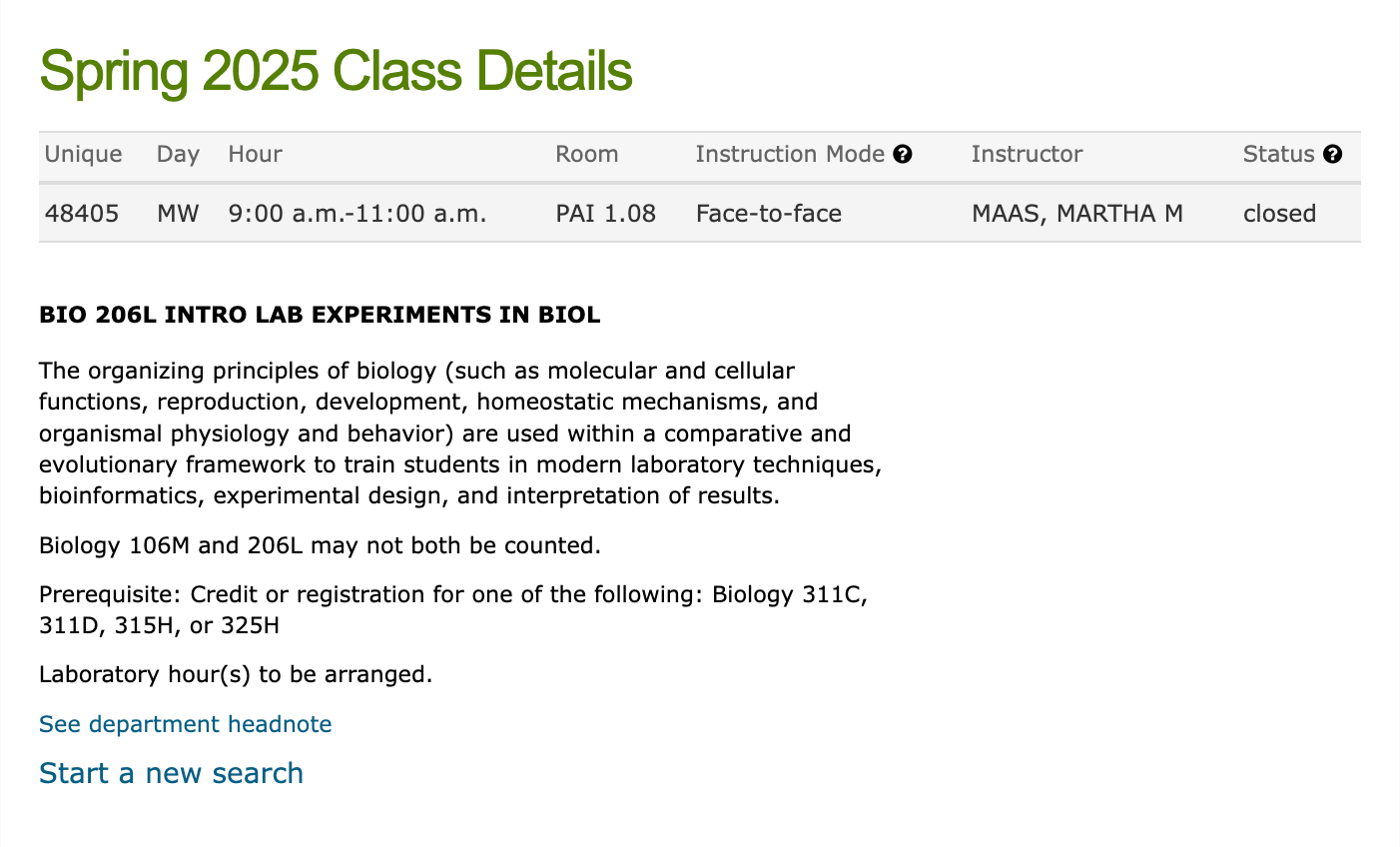
Course Details
UT fails to integrate public information on course syllabi, grade distribution, and ratings directly into their registration course catalog site.
Students voice concerns with The Daily Texan


Emily Caldwell

Column
Registration isn’t fun...

Ezra Gomez
Column
Registration needs to be simplified

Sophia Kurz
News
UT students address registration frustrations
UT Austin’s official student newspaper, The Daily Texan, has frequently covered student opinions regarding the university’s registration system.
An existing solution used by 42k Longhorns began to break and fall short of emerging needs
Developed by a student in 2018, UT Registration Plus ↗ is a chrome extension that addressed many issues with registration, but since the founding student graduated in 2021, the tool’s design was aging, features were breaking, and student needs were growing.
Demo of UT Registration Plus v1
The tool visualized grade distributions and other publicly available data sources that was otherwise inaccessible or unknown by most students.
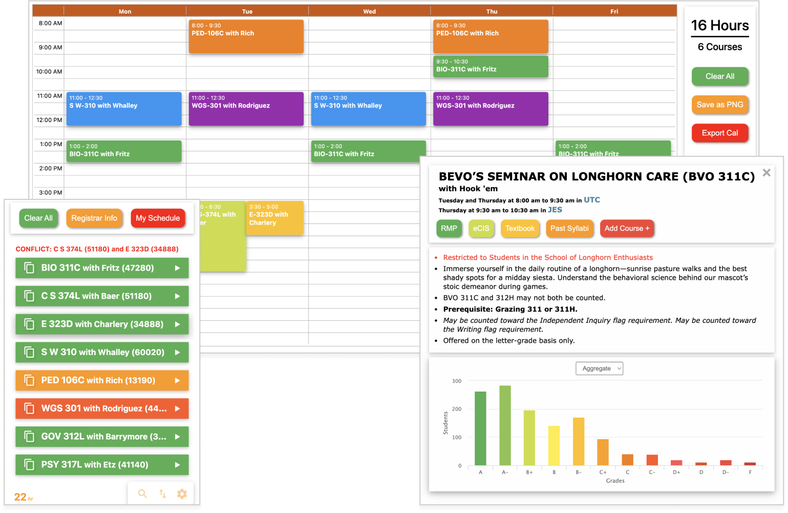
Original User Interface
The tool visualized your planned courses but didn’t support backup schedules and carried an outdated, often inaccessible, design.

Revitalize UT Reg. Plus to help Longhorns build schedules around real-life constraints and enable scalability?
Envisioning its potential with new functionality and character, I reached out to the founder and pitched a design overhaul. They loved the direction and passed me the torch to direct the tool’s evolution and redefine the user experience for 50,000 students.
>300 ways UT Registration Plus
could meet student needs


Allow for Plan B
backup schedules
If a student’s planned schedule fails during registration, a backup plan must be prepared, but that functionality was not available.
74 mentions


Consider personal commitments
Students want a better way to plan around personal or work commitments, and filter courses that fit their schedule.
65 mentions

Be accessible
and customizable
Autonomy over course block colors and inclusive design will help craft a schedule that feels more personable for everyone.
61 mentions
What needs are not met in UT Reg. Plus? With this question in mind, I surveyed over 300 students to identify pain points. The key insights unveiled the frictions in schedule planning, the biggest being unable to plan backup schedules. UT’s campus newspaper, The Daily Texan, wrote about the survey ↗, signaling a strong interest in our effort.
Keeping a finger on
the pulse of student needs
To give students agency throughout the project’s evolution, I built a public Discord server and gathered 100+ students from diverse backgrounds to beta test, critique, and spark new ideas when I lacked creativity, and point out edge cases when my blind spots fell short.
Organizing a developer team for handoff and technical feasibility
I engineer experiences, not software, so I organized and directed a team of 10 student developers to implement my designs and guide technical feasibility. This taught me how to communicate design to a non-designer and achieve smooth handoff for implementation.
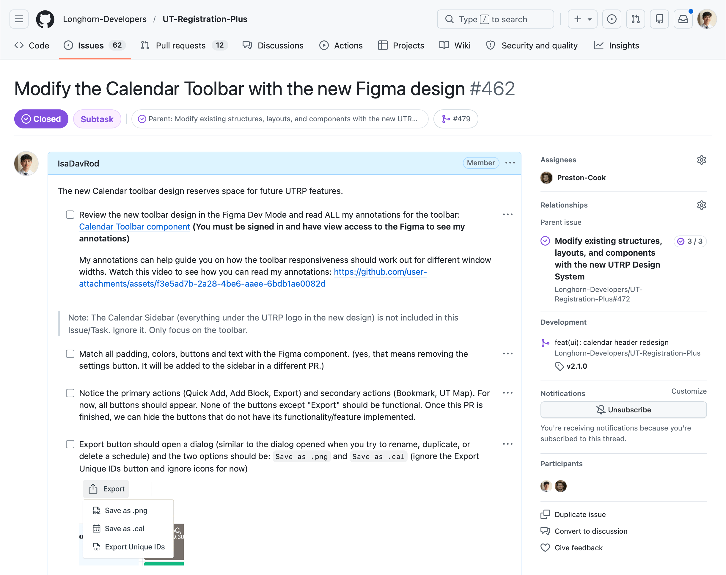
Drafting 75+ GitHub Issues
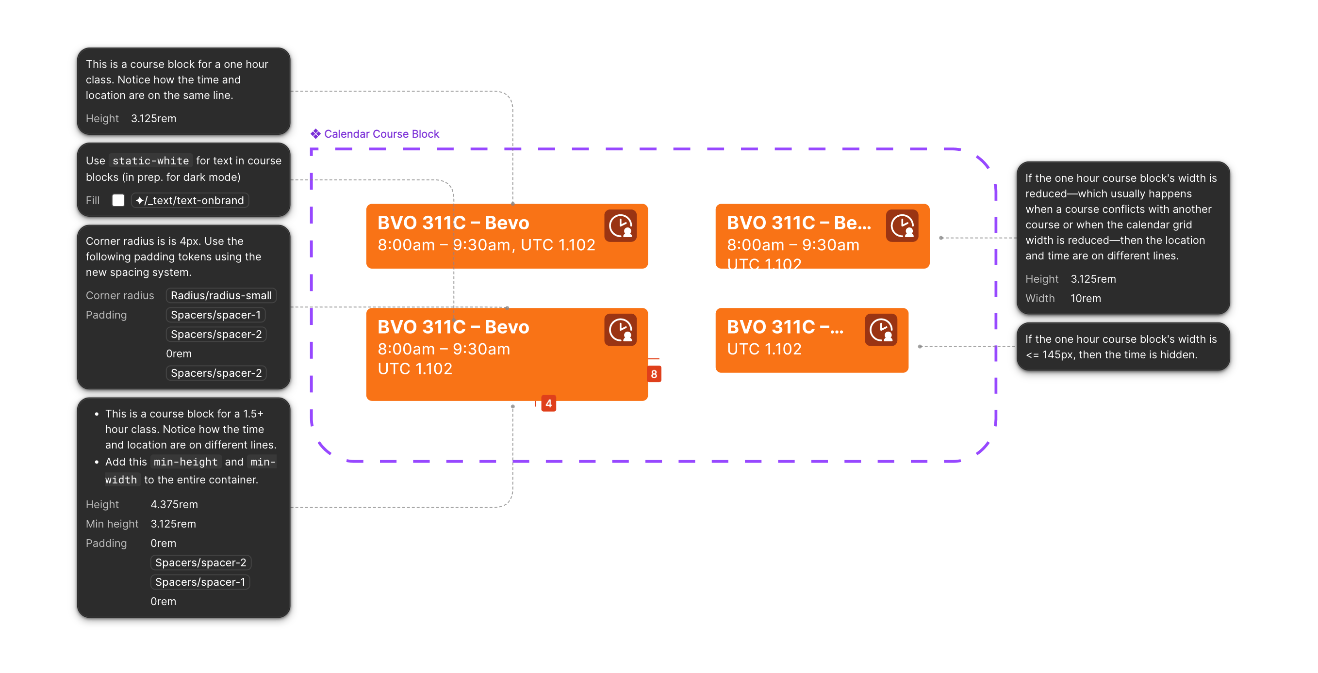
Utilizing Figma Dev Mode
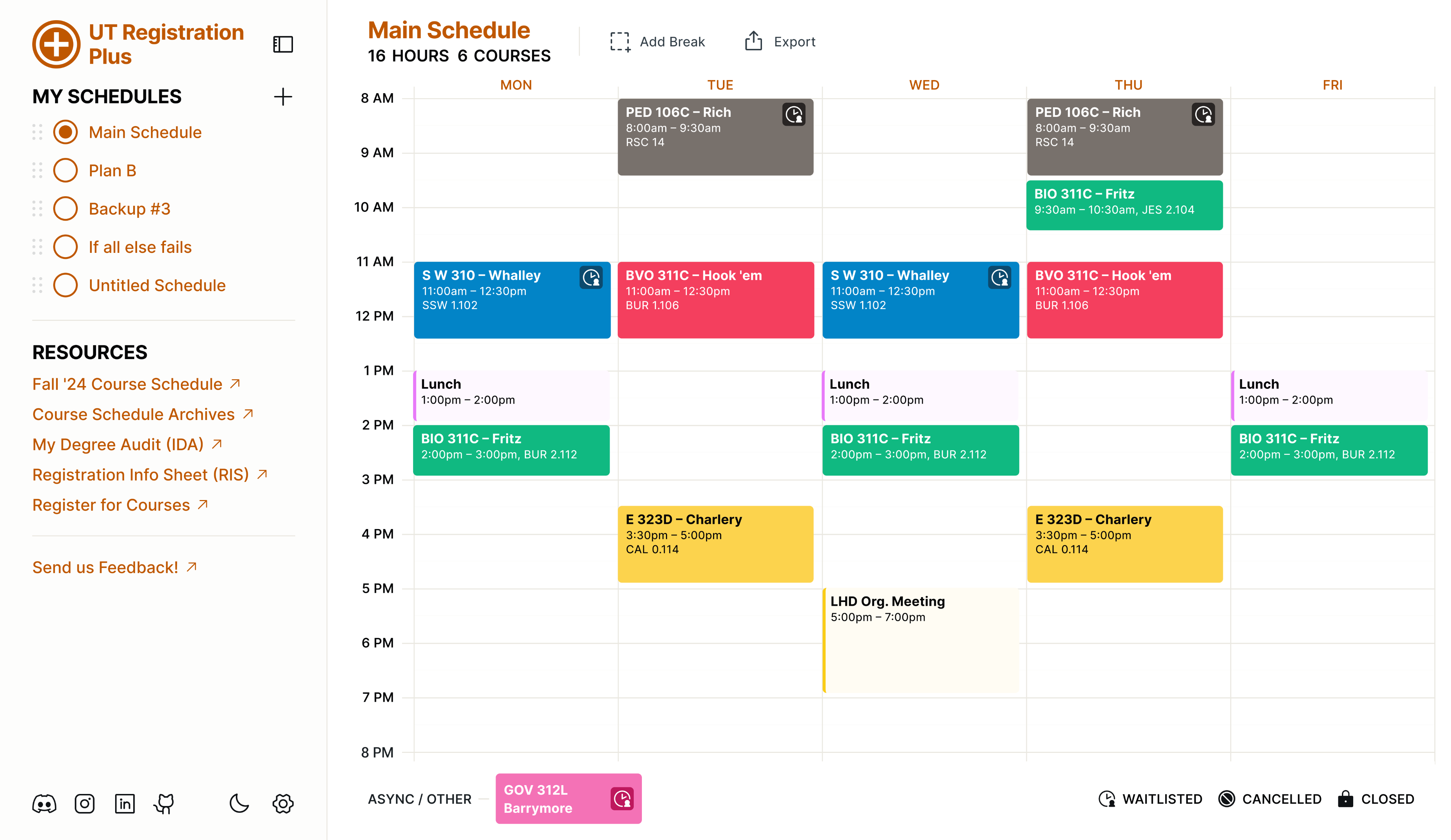
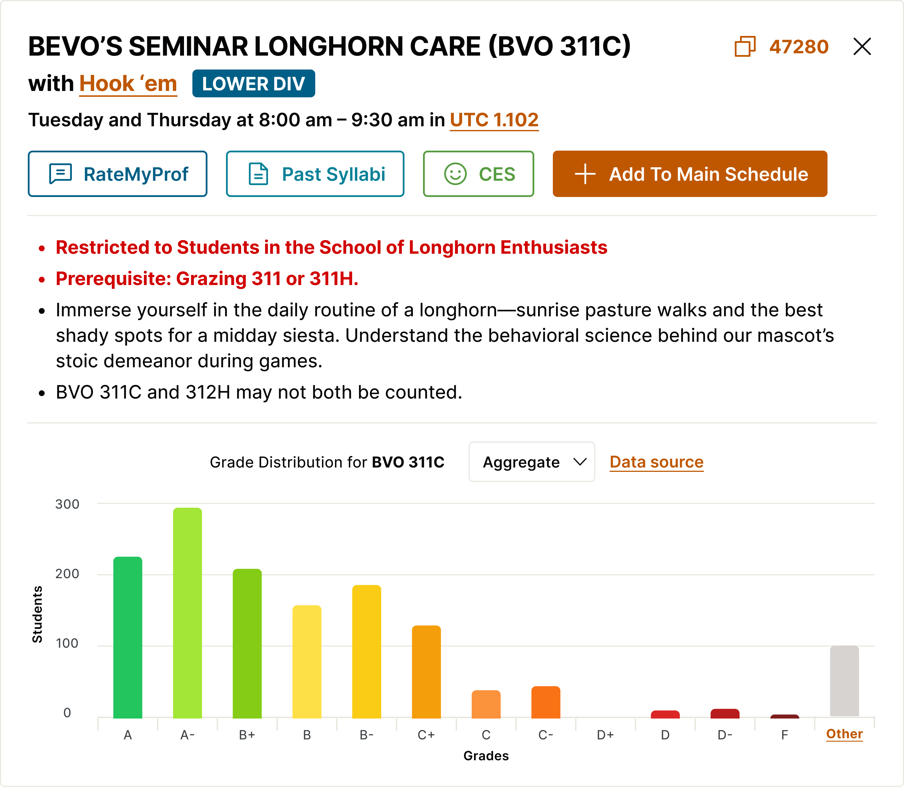
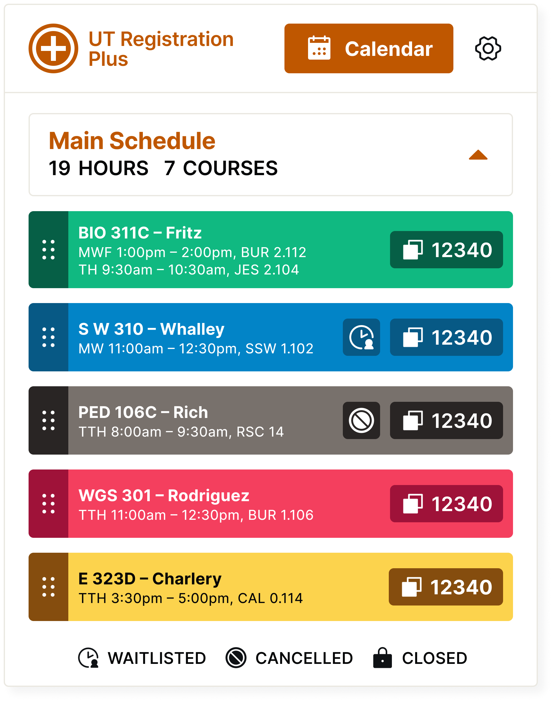
A familiar multi-schedule planner, UT Registration Plus v2
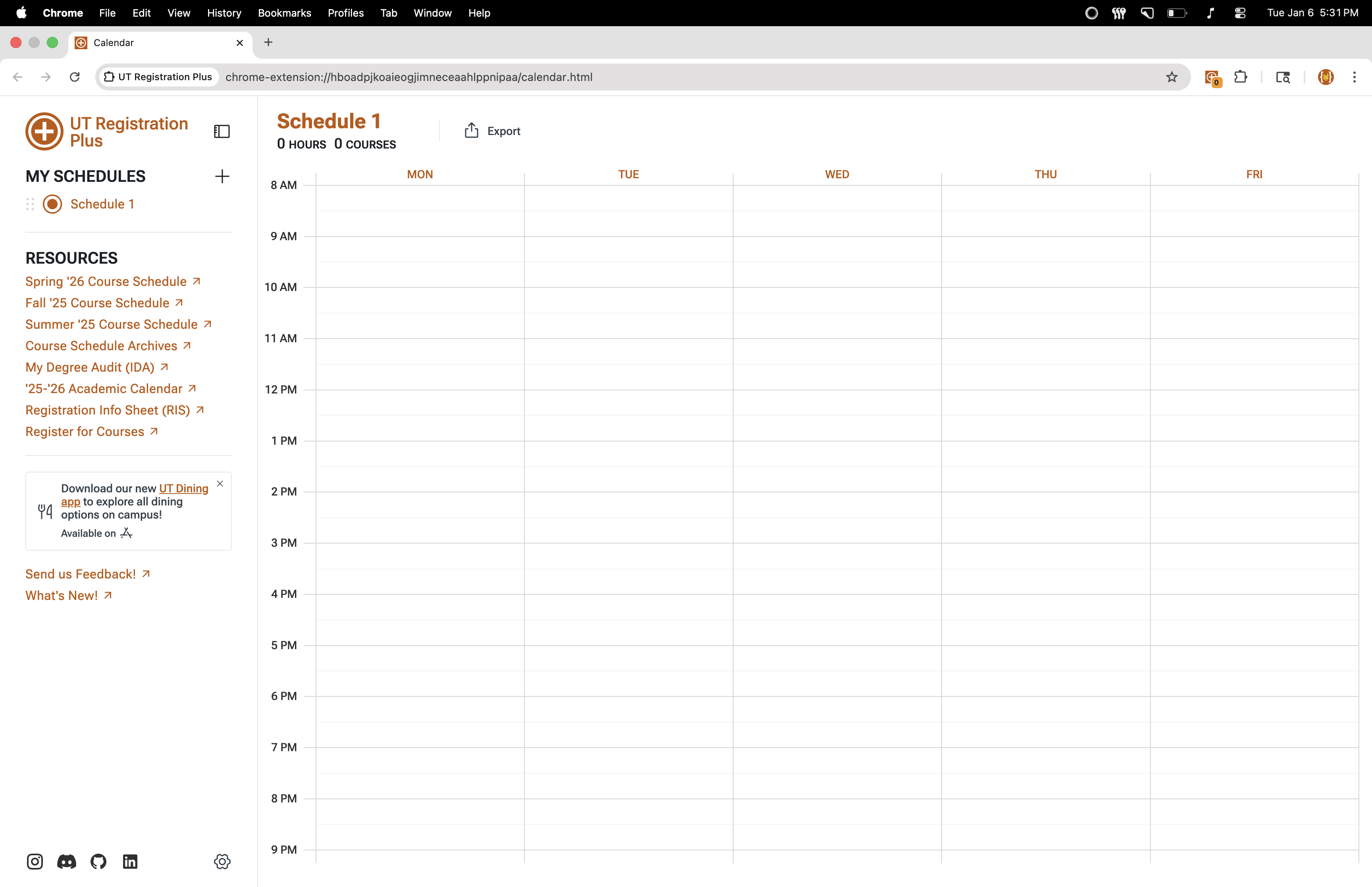
Just before registration began in October 2024, our v2 update rolled out to the student body. It was a success amid challenges with data migration and Chrome permissions that disabled the extension for all users. Our recovery was strong, showing an 86% retention rate leading up to the registration period, and growing our user base by 35% thereafter.
People hate change,
so I designed for familiarity
50,000+ UT Austin students already used UT Reg. Plus. Overhauling its interface risked being a distraction and controversy. Instead, I aimed for familiarity, integrating UT’s brand identity and maintaining the tool’s original layout, avoiding a UI design shock that caused students to relearn the tool or felt out of place with the page it lives in: UT’s course schedule site.
UT Austin’s Primary Color
Supportives
Accents
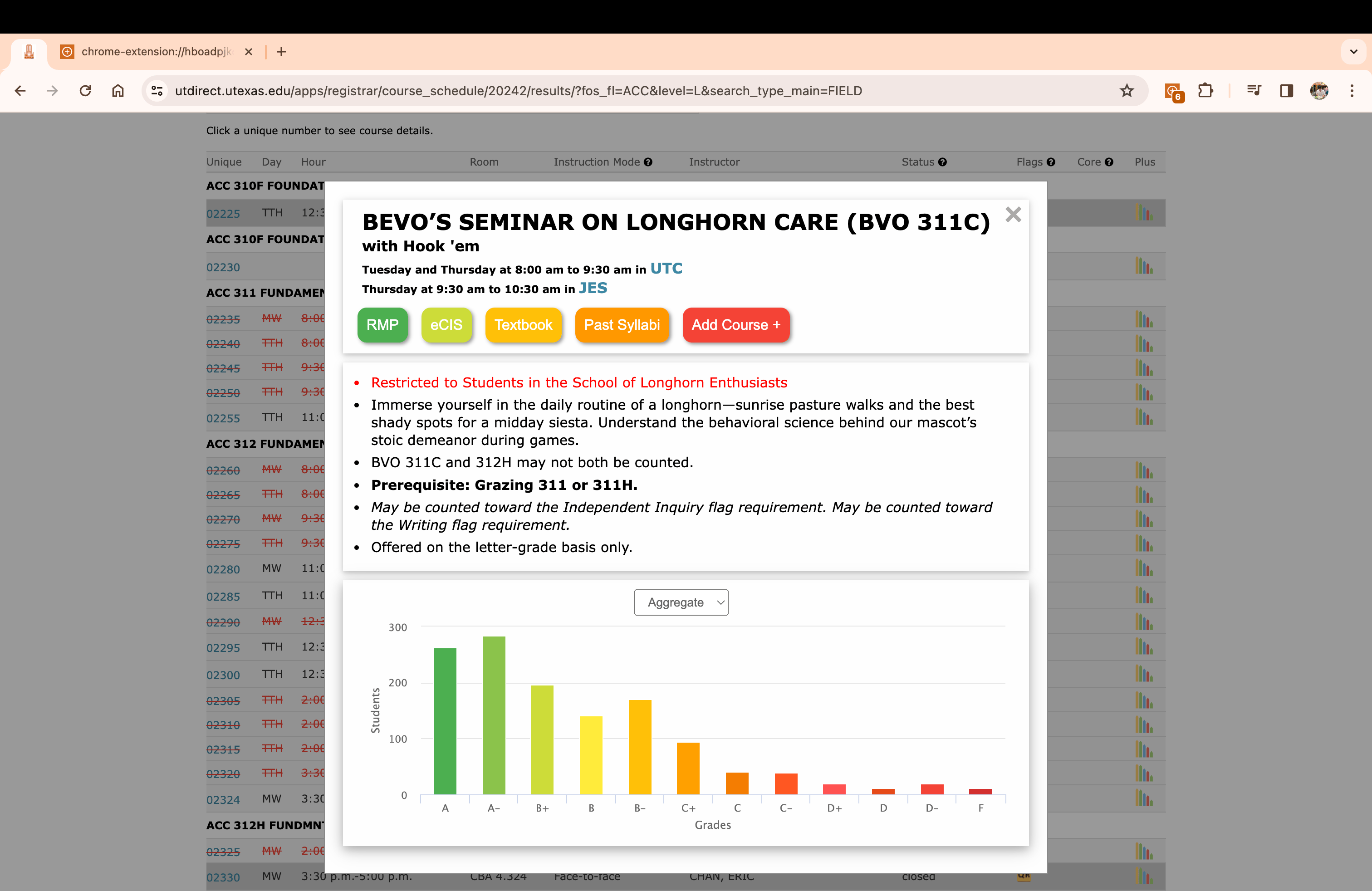
Old UI and Visual Identity
The old interface lacked button hierarchy and the color choice felt distant from UT’s visual identity.
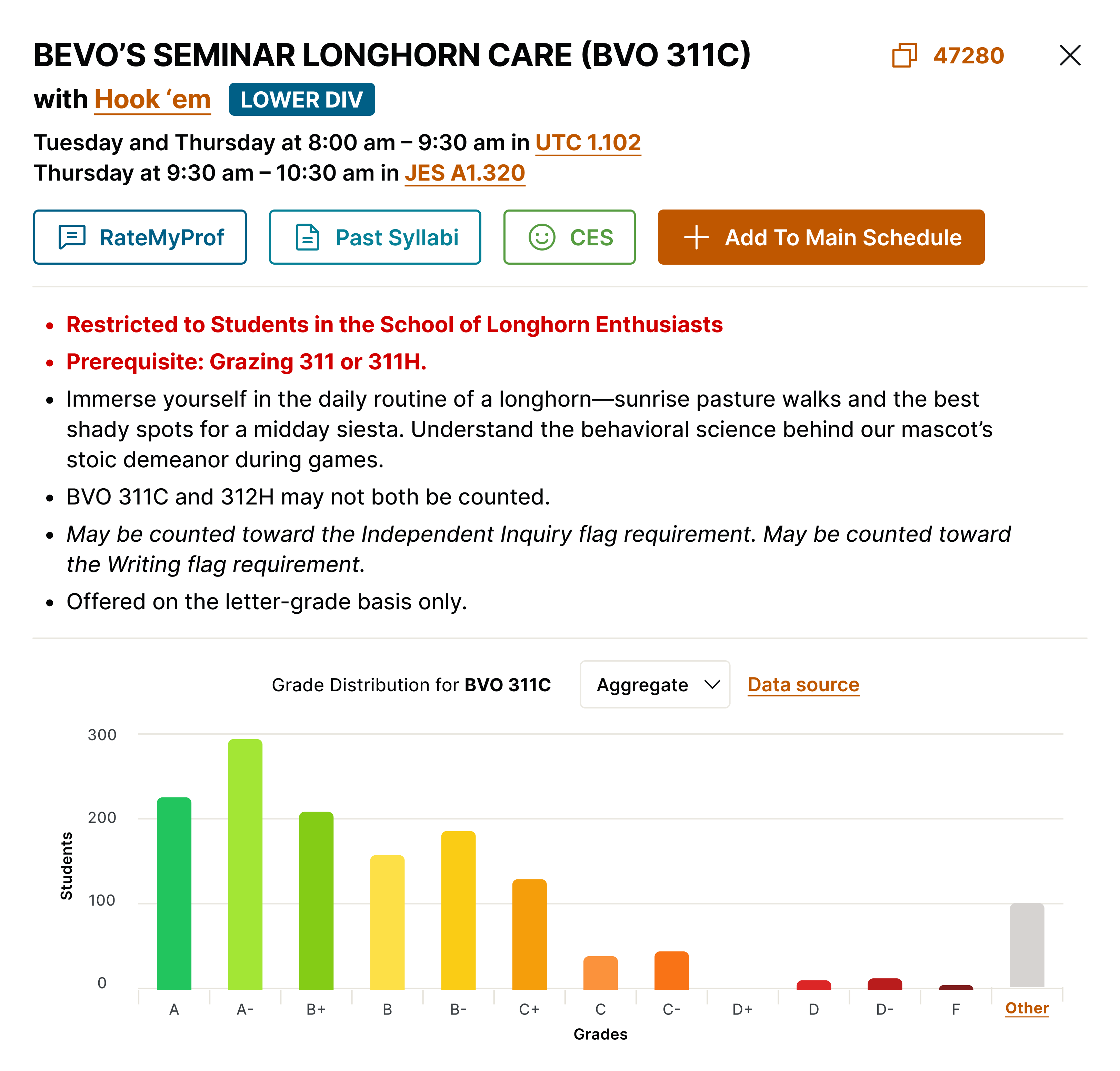
New UI and Visual Identity
Maintaining the original layout and utilizing UT’s brand colors helped build trust and recognition with students.
Modeling our calendar after Google Calendar to preserve familiarity
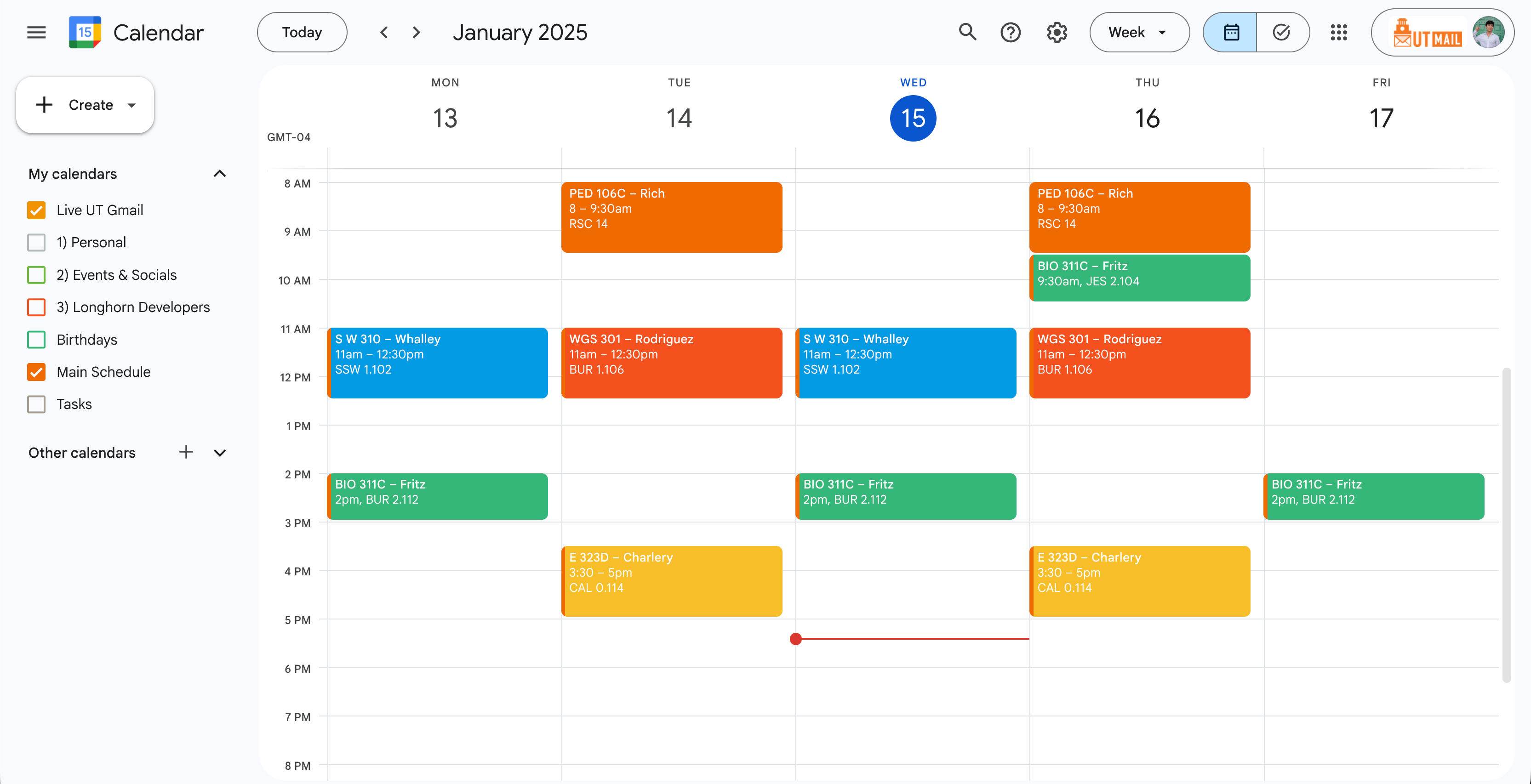
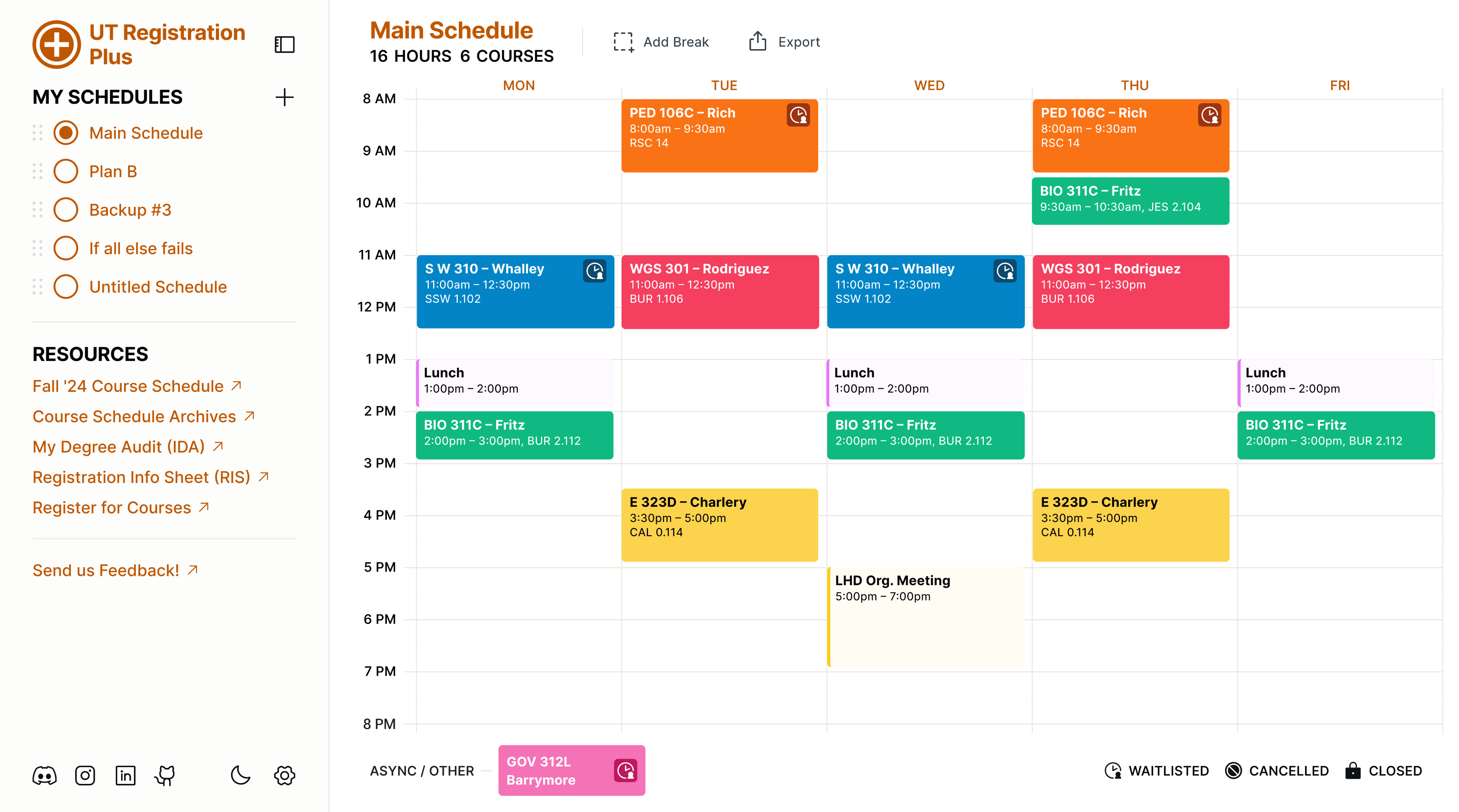
UT Reg. Plus’ old layout was too simple to support backup schedules, requiring a revamped interface. To avoid sacrificing familiarity, I drew from Jakob’s Law and design patterns, using the layout from Google Calendar, which is widely used by Longhorns.

Old Layout
The simple layout left little room for major features. Keeping the layout just to make the redesign feel familiar, as I did with the Course Detail Modal, wasn’t a practical choice.
Google Calendar Layout
Specific design patterns borrowed from Google Calendar included the left sidebar for listing schedules, the top toolbar, and the event block’s information hierarchy.
New Layout
The new Calendar View maintains UT’s visual identity, allows space for new tools, and uses a similar layout as Google Calendar, making it easy for students to adjust to the redesign.
“Almost all of design stems from making sure that a user can figure out what to do, and can tell what’s going on. The beauty and difficulty lie in what happens when the object at hand is new, but needs to feel familiar so that its newness isn’t baffling.”
User Friendly by Cliff Kuang
View important class information
Get an overview of your courses
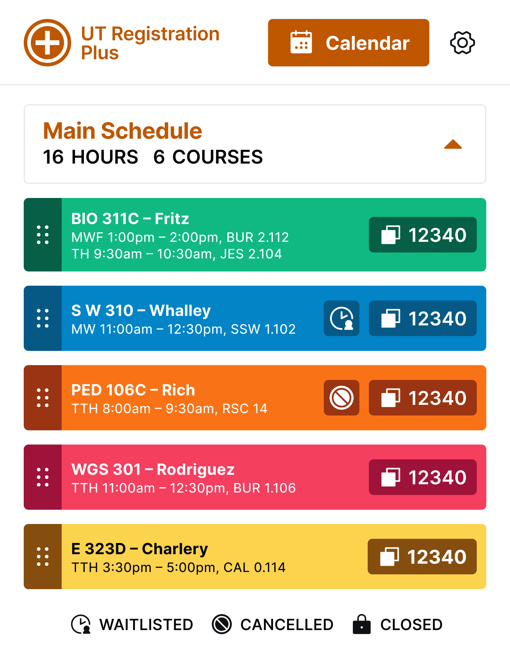
Build your ideal schedule
Building a system
that grows with us
Over 50,000 Longhorns use UT Reg. Plus every term, including university advisors. With a public Discord server of over 800 Longhorns, open source code and design files, more students than ever are helping contribute to UT Reg. Plus. We hope to inspire students in other universities to use our work as a stepping stone for change in their own registration systems.
35%
User Growth
8,000 more students installed UT Reg. Plus v2 for ‘24-’25 compared to the previous academic year without v2
100,000
Record Lifetime Installs
UT Reg. Plus surpassed over 100,000 lifetime installs since v2 was released, indicating sustained popularity.
+3
Specialized Teams Made
Established a product, development, and design team to constantly improve the tool and meet new student needs.
x10
Student Engagement
100+ student insights during Fall 2024 by integrating a feedback channel directly in the tool.


UT Reg. Plus v2 serves as a testament when student ingenuity and talent are mobilized to challenge a common issue, sustainably.
But many Longhorns have built solutions for common student issues, and their projects often become obsolete after they graduate.
That is why I founded Longhorn Developers.


Institutionalizing
student-led innovation
with Longhorn Developers
Today, Longhorn Developers is a community of over 100 Longhorns who are learning and building real solutions for campus-wide issues through product, design, and development.
UT Registration Plus
Overhauling the tool 50,000 Longhorns plan their semesters with.
Impact
35% User Growth (+8k)
Surpassed 100k Installs
My Role
Product Direction
Design Direction
The Herd
1 Government Major (me!)
10 Computer Sci. Majors
Timeline
Spring ‘23 → Fall ‘24
Academic Semesters
For 55,000 students, every term starts with planning a schedule
At UT Austin, registration season occurs near the end of each semester, a time that is notoriously every Longhorn’s biggest headache. To prepare, students have to plan a fitted schedule, but that starts with searching for courses in the source of the headache, UT Austin’s outdated Course Schedule website.
UT’s registration website is 18 years out of date
UT’s most utilized site by students is also one of their most criticized and outdated site. The UT course schedule website for registration lacks native schedule visualizations and bookmarking functionality, creating a tedious planning process that leads to missed requirements and steals valuable time from focusing on what matters: Graduating (and pesky exams).
UT Austin’s Course Catalog
Navigating an indigestible list of courses without bookmarking functionality, students resorted to using spreadsheets as a schedule planner.
Course Details
UT fails to integrate public information on course syllabi, grade distribution, and ratings directly into their registration course catalog site.
Students voice concerns with The Daily Texan
Emily Caldwell
Column
Registration isn’t fun...
Ezra Gomez
Column
Registration needs to be simplified
Sophia Kurz
News
UT students address registration frustrations
UT Austin’s official student newspaper, The Daily Texan, has frequently covered student opinions regarding the university’s registration system.
An existing solution used by 42k Longhorns began to break and fall short of emerging needs
Developed by a student in 2018, UT Registration Plus ↗ is a chrome extension that addressed many issues with registration, but since the founding student graduated in 2021, the tool’s design was aging, features were breaking, and student needs were growing.
Demo of UT Registration Plus v1
The tool visualized grade distributions and other publicly available data sources that was otherwise inaccessible or unknown by most students.
Original User Interface
The tool visualized your planned courses but didn’t support backup schedules and carried an outdated, often inaccessible, design.
Revitalize UT Reg. Plus to help Longhorns build schedules around real-life constraints and enable scalability?
Envisioning its potential with new functionality and character, I reached out to the founder and pitched a design overhaul. They loved the direction and passed me the torch to direct the tool’s evolution and redefine the user experience for 50,000 students.
>300 ways UT Registration Plus
could meet student needs
Allow for Plan B
backup schedules
If a student’s planned schedule fails during registration, a backup plan must be prepared, but that functionality was not available.
74 mentions
Consider personal commitments
Students want a better way to plan around personal or work commitments, and filter courses that fit their schedule.
65 mentions
Be accessible
and customizable
Autonomy over course block colors and inclusive design will help craft a schedule that feels more personable for everyone.
61 mentions
What needs are not met in UT Reg. Plus? With this question in mind, I surveyed over 300 students to identify pain points. The key insights unveiled the frictions in schedule planning, the biggest being unable to plan backup schedules. UT’s campus newspaper, The Daily Texan, wrote about the survey ↗, signaling a strong interest in our effort.
Keeping a finger on
the pulse of student needs
To give students agency throughout the project’s evolution, I built a public Discord server and gathered 100+ students from diverse backgrounds to beta test, critique, and spark new ideas when I lacked creativity, and point out edge cases when my blind spots fell short.
Organizing a developer team for handoff and technical feasibility
I engineer experiences, not software, so I organized and directed a team of 10 student developers to implement my designs and guide technical feasibility. This taught me how to communicate design to a non-designer and achieve smooth handoff for implementation.
Drafting 75+ GitHub Issues
Utilizing Figma Dev Mode
A familiar multi-schedule planner, UT Registration Plus v2
Just before registration began in October 2024, our v2 update rolled out to the student body. It was a success amid challenges with data migration and Chrome permissions that disabled the extension for all users. Our recovery was strong, showing an 86% retention rate leading up to the registration period, and growing our user base by 35% thereafter.
People hate change,
so I designed for familiarity
50,000+ UT Austin students already used UT Reg. Plus. Overhauling its interface risked being a distraction and controversy. Instead, I aimed for familiarity, integrating UT’s brand identity and maintaining the tool’s original layout, avoiding a UI design shock that caused students to relearn the tool or felt out of place with the page it lives in: UT’s course schedule site.
UT Austin’s Primary Color
Supportives
Accents
Old UI and Visual Identity
The old interface lacked button hierarchy and the color choice felt distant from UT’s visual identity.
New UI and Visual Identity
Maintaining the original layout and utilizing UT’s brand colors helped build trust and recognition with students.
Modeling our calendar after Google Calendar to preserve familiarity
UT Reg. Plus’ old layout was too simple to support backup schedules, requiring a revamped interface. To avoid sacrificing familiarity, I drew from Jakob’s Law and design patterns, using the layout from Google Calendar, which is widely used by Longhorns.
Old Layout
The simple layout left little room for major features. Keeping the layout just to make the redesign feel familiar, as I did with the Course Detail Modal, wasn’t a practical choice.
Google Calendar Layout
Specific design patterns borrowed from Google Calendar included the left sidebar for listing schedules, the top toolbar, and the event block’s information hierarchy.
New Layout
The new Calendar View maintains UT’s visual identity, allows space for new tools, and uses a similar layout as Google Calendar, making it easy for students to adjust to the redesign.
“Almost all of design stems from making sure that a user can figure out what to do, and can tell what’s going on. The beauty and difficulty lie in what happens when the object at hand is new, but needs to feel familiar so that its newness isn’t baffling.”
User Friendly by Cliff Kuang
View important class information
Old UI
Fall '23
Spring '24
New UI
Get an overview of your courses
Old UI
Fall '23
Spring '24
New UI
Build your ideal schedule
Old UI
Fall '23
Spring '24
New UI
Building a system
that grows with us
Over 50,000 Longhorns use UT Reg. Plus every term, including university advisors. With a public Discord server of over 800 Longhorns, open source code and design files, more students than ever are helping contribute to UT Reg. Plus. We hope to inspire students in other universities to use our work as a stepping stone for change in their own registration systems.
35%
User Growth
8,000 more students installed UT Reg. Plus v2 for ‘24-’25 compared to the previous academic year without v2
100,000
Record Lifetime Installs
UT Reg. Plus surpassed over 100,000 lifetime installs since v2 was released, indicating sustained popularity.
+3
Specialized Teams Made
Established a product, development, and design team to constantly improve the tool and meet new student needs.
x10
Student Engagement
100+ student insights during Fall 2024 by integrating a feedback channel directly in the tool.
UT Reg. Plus v2 serves as a testament when student ingenuity and talent are mobilized to challenge a common issue, sustainably.
But many Longhorns have built solutions for common student issues, and their projects often become obsolete after they graduate.
That is why I founded Longhorn Developers.
Institutionalizing
student-led innovation
with Longhorn Developers
Today, Longhorn Developers is a community of over 100 Longhorns who are learning and building real solutions for campus-wide issues through product, design, and development.

Solutions we are building together
Longhorn Developers is currently working on 12 different projects each aimed at addressing a specific student issue including combating food insecurity, navigating campus, and optimizing degree planning.
We have been sponsored by UT's CIO, VP of Technology, and the Enterprise Technology Department since 2025 to access infrastructure and partner for systematic reform.
What started as a browser extension is now a bet on student potential, and our success will be defined by the problems we solve together.
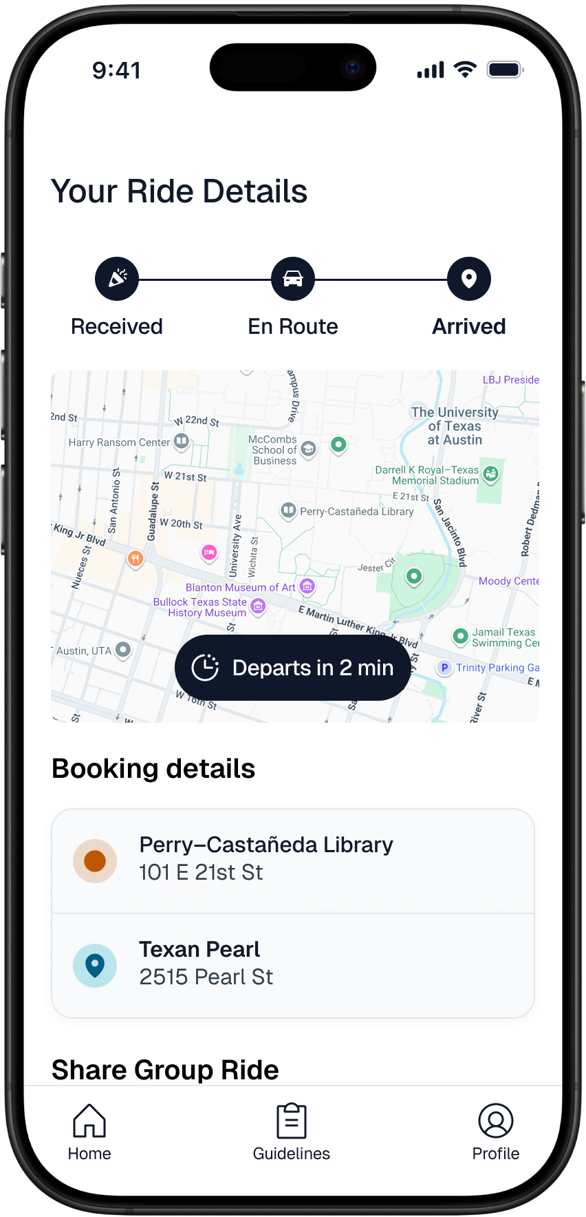
Longhorn Lifts
Streamlines UT’s night rides, grocery shuttles, & pickup rides
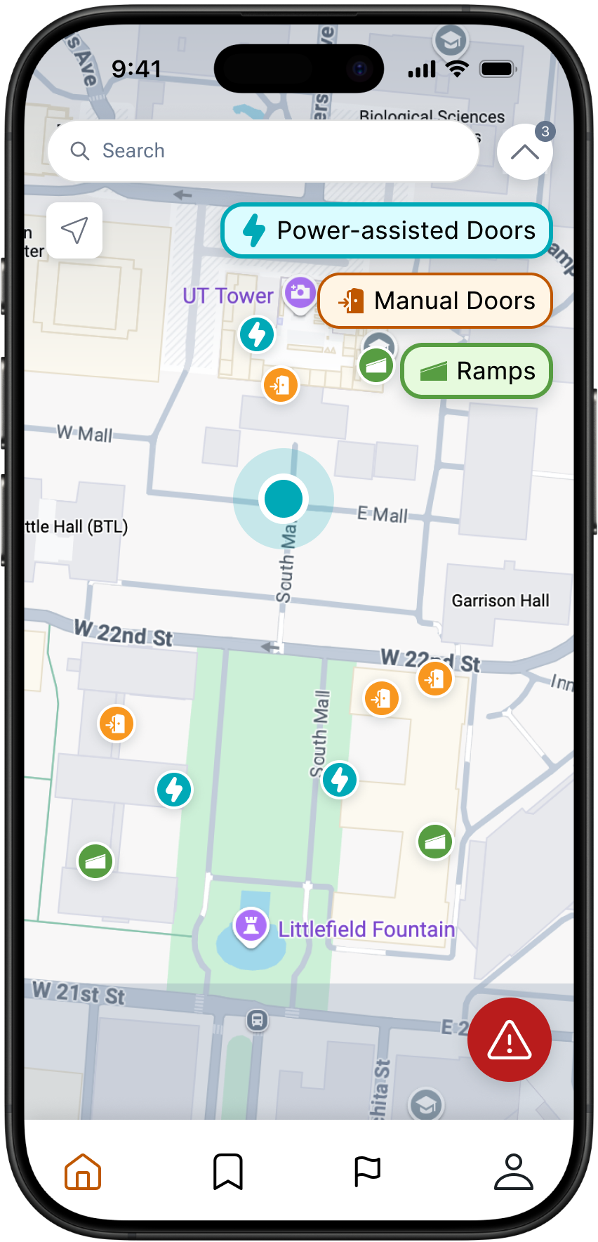
Mobilize UT
Assists UT students with mobility disabilities to navigate campus
SECTIONS
01. Overview
02. Context & Problems
03. Research
04. Solution
05. Design
06. Impact
Work
About
Resume
UT Registration Plus
Overhauling the tool 50,000 Longhorns plan their semesters with.
Impact
35% User Growth (+8k)
Surpassed 100k Installs
My Role
Product Direction
Design Direction
The Herd
1 Government Major (me!)
10 Computer Sci. Majors
Timeline
Spring ‘23 → Fall ‘24
Academic Semesters
At UT Austin, registration season occurs near the end of each semester, a time that is notoriously every Longhorn’s biggest headache. To prepare, students have to plan a fitted schedule, but that starts with searching for courses in the source of the headache, UT Austin’s outdated Course Schedule website.
For 55,000 students, every term starts with planning a schedule
UT’s registration website is 18 years out of date
UT’s most utilized site by students is also one of their most criticized and outdated site. The UT course schedule website for registration lacks native schedule visualizations and bookmarking functionality, creating a tedious planning process that leads to missed requirements and steals valuable time from focusing on what matters: Graduating (and pesky exams).
UT Austin’s Course Catalog
Navigating an indigestible list of courses without bookmarking functionality, students resorted to using spreadsheets as a schedule planner.
Course Details
UT fails to integrate public information on course syllabi, grade distribution, and ratings directly into their registration course catalog site.
Students voice concerns with The Daily Texan
Emily Caldwell
Column
Registration isn’t fun...
Ezra Gomez
Column
Registration needs to be simplified
Sophia Kurz
News
UT students address registration frustrations
UT Austin’s official student newspaper, The Daily Texan, has frequently covered student opinions regarding the university’s registration system.
An existing solution used by 42k Longhorns began to break and fall short of emerging needs
Developed by a student in 2018, UT Registration Plus ↗ is a chrome extension that addressed many issues with registration, but since the founding student graduated in 2021, the tool’s design was aging, features were breaking, and student needs were growing.
Demo of UT Registration Plus v1
The tool visualized grade distributions and other publicly available data sources that was otherwise inaccessible or unknown by most students.
Original User Interface
The tool visualized your planned courses but didn’t support backup schedules and carried an outdated, often inaccessible, design.
Revitalize UT Reg. Plus to help Longhorns build schedules around real-life constraints and enable scalability?
Envisioning its potential with new functionality and character, I reached out to the founder and pitched a design overhaul. They loved the direction and passed me the torch to direct the tool’s evolution and redefine the user experience for 50,000 students.
>300 ways UT Registration Plus
could meet student needs
Allow for Plan B
backup schedules
If a student’s planned schedule fails during registration, a backup plan must be prepared, but that functionality was not available.
74 mentions
Consider personal commitments
Students want a better way to plan around personal or work commitments, and filter courses that fit their schedule.
65 mentions
Be accessible
and customizable
Autonomy over course block colors and inclusive design will help craft a schedule that feels more personable for everyone.
61 mentions
What needs are not met in UT Reg. Plus? With this question in mind, I surveyed over 300 students to identify pain points. The key insights unveiled the frictions in schedule planning, the biggest being unable to plan backup schedules. UT’s campus newspaper, The Daily Texan, wrote about the survey ↗, signaling a strong interest in our effort.
Keeping a finger on
the pulse of student needs
To give students agency throughout the project’s evolution, I built a public Discord server and gathered 100+ students from diverse backgrounds to beta test, critique, and spark new ideas when I lacked creativity, and point out edge cases when my blind spots fell short.
Organizing a developer team for handoff and technical feasibility
I engineer experiences, not software, so I organized and directed a team of 10 student developers to implement my designs and guide technical feasibility. This taught me how to communicate design to a non-designer and achieve smooth handoff for implementation.
Drafting 75+ GitHub Issues
Utilizing Figma Dev Mode
A familiar multi-schedule planner, UT Registration Plus v2
Just before registration began in October 2024, our v2 update rolled out to the student body. It was a success amid challenges with data migration and Chrome permissions that disabled the extension for all users. Our recovery was strong, showing an 86% retention rate leading up to the registration period, and growing our user base by 35% thereafter.
People hate change,
so I designed for familiarity
50,000+ UT Austin students already used UT Reg. Plus. Overhauling its interface risked being a distraction and controversy. Instead, I aimed for familiarity, integrating UT’s brand identity and maintaining the tool’s original layout, avoiding a UI design shock that caused students to relearn the tool or felt out of place with the page it lives in: UT’s course schedule site.
UT Austin’s Primary Color
Supportives
Accents
Old UI and Visual Identity
The old interface lacked button hierarchy and the color choice felt distant from UT’s visual identity.
New UI and Visual Identity
Maintaining the original layout and utilizing UT’s brand colors helped build trust and recognition with students.
Modeling our calendar after Google Calendar to preserve familiarity
UT Reg. Plus’ old layout was too simple to support backup schedules, requiring a revamped interface. To avoid sacrificing familiarity, I drew from Jakob’s Law and design patterns, using the layout from Google Calendar, which is widely used by Longhorns.
Old Layout
The simple layout left little room for major features. Keeping the layout just to make the redesign feel familiar, as I did with the Course Detail Modal, wasn’t a practical choice.
Google Calendar Layout
Specific design patterns borrowed from Google Calendar included the left sidebar for listing schedules, the top toolbar, and the event block’s information hierarchy.
New Layout
The new Calendar View maintains UT’s visual identity, allows space for new tools, and uses a similar layout as Google Calendar, making it easy for students to adjust to the redesign.
“Almost all of design stems from making sure that a user can figure out what to do, and can tell what’s going on. The beauty and difficulty lie in what happens when the object at hand is new, but needs to feel familiar so that its newness isn’t baffling.”
User Friendly by Cliff Kuang

Added a spacing system, Phosphor icons, and building room numbers
View important class information
Old UI
Fall '23
Spring '24
New UI
Clarified which schedule you are adding to.
Changed color to Burnt Orange because Green assumed course has been added already.
Added breathing room too bring back course details (time, loc)
Get an overview of your courses
Old UI
Fall '23
Spring '24
New UI
Labeled the obscure Calendar button
polished spacing and color tokens
Polished sidebar, removed extra links
Other buttons and socials here
Build your ideal schedule
Old UI
Fall '23
Spring '24
New UI
Introduced the toolbar for future updates
Course status
legend
Building a system
that grows with us
Over 50,000 Longhorns use UT Reg. Plus every term, including university advisors. With a public Discord server of over 800 Longhorns, open source code and design files, more students than ever are helping contribute to UT Reg. Plus. We hope to inspire students in other universities to use our work as a stepping stone for change in their own registration systems.
35%
User Growth
8,000 more students installed UT Reg. Plus v2 for ‘24-’25 compared to the previous academic year without v2
100k
Record Lifetime Installs
UT Reg. Plus surpassed over 100,000 lifetime installs since v2 was released, indicating sustained popularity.
+3
Specialized Teams Made
Established a product, development, and design team to constantly improve the tool and meet new student needs.
x10
Student Engagement
100+ student insights during Fall 2024 by integrating a feedback channel directly in the tool.
UT Reg. Plus v2 serves as a testament when student ingenuity and talent are mobilized to challenge a common issue, sustainably.
But many Longhorns have built solutions for common student issues, and their projects often become obsolete after they graduate.
That is why I founded Longhorn Developers.
Today, Longhorn Developers is a community of over 100 Longhorns who are learning and building real solutions for campus-wide issues through product, design, and development.
Institutionalizing
student-led innovation
with Longhorn Developers
Solutions we are building together
Longhorn Developers is currently working on 12 different projects each aimed at addressing a specific student issue including combating food insecurity, navigating campus, and optimizing degree planning.
We have been sponsored by UT's CIO, VP of Technology, and the Enterprise Technology Department since 2025 to access infrastructure and partner for systematic reform.
What started as a browser extension is now a bet on student potential, and our success will be defined by the problems we solve together.
Longhorn Lifts
Streamlines UT’s night rides, grocery shuttles, & pickup rides
Mobilize UT
Assists UT students with mobility disabilities to navigate campus
SECTIONS
01. Overview
02. Context & Problems
03. Research
04. Solution
05. Design
06. Impact
Work
About
Resume
UT Registration
Plus
A chrome extension assisting 50,000+ Longhorns with course schedule planning for UT Austin’s 18-year-old registration system.
SECTIONS
01. Overview
02. Context & Problems
03. Research
04. Solution
05. Design
06. Impact
Work
About
Resume
UT Registration Plus
Overhauling the tool 50,000 Longhorns plan their semesters with.
Impact
35% User Growth (+8k)
Surpassed 100k Installs
My Role
Product Direction
Design Direction
The Herd
1 Government Major (me!)
10 Computer Sci. Majors
Timeline
Spring ‘23 → Fall ‘24
Academic Semesters
At UT Austin, registration season occurs near the end of each semester, a time that is notoriously every Longhorn’s biggest headache. To prepare, students have to plan a fitted schedule, but that starts with searching for courses in the source of the headache, UT Austin’s outdated Course Schedule website.
For 55,000 students, every term starts with planning a schedule
UT’s registration website is 18 years out of date
UT’s most utilized site by students is also one of their most criticized and outdated site. The UT course schedule website for registration lacks native schedule visualizations and bookmarking functionality, creating a tedious planning process that leads to missed requirements and steals valuable time from focusing on what matters: Graduating (and pesky exams).
UT Austin’s Course Catalog
Navigating an indigestible list of courses without bookmarking functionality, students resorted to using spreadsheets as a schedule planner.
Course Details
UT fails to integrate public information on course syllabi, grade distribution, and ratings directly into their registration course catalog site.
Students voice concerns with The Daily Texan
Emily Caldwell
Column
Registration isn’t fun...
Ezra Gomez
Column
Registration needs to be simplified
Sophia Kurz
News
UT students address registration frustrations
UT Austin’s official student newspaper, The Daily Texan, has frequently covered student opinions regarding the university’s registration system.
An existing solution used by 42k Longhorns began to break and fall short of emerging needs
Developed by a student in 2018, UT Registration Plus ↗ is a chrome extension that addressed many issues with registration, but since the founding student graduated in 2021, the tool’s design was aging, features were breaking, and student needs were growing.
Demo of UT Registration Plus v1
The tool visualized grade distributions and other publicly available data sources that was otherwise inaccessible or unknown by most students.
Original User Interface
The tool visualized your planned courses but didn’t support backup schedules and carried an outdated, often inaccessible, design.
Revitalize UT Reg. Plus to help Longhorns build schedules around real-life constraints and enable scalability?
Envisioning its potential with new functionality and character, I reached out to the founder and pitched a design overhaul. They loved the direction and passed me the torch to direct the tool’s evolution and redefine the user experience for 50,000 students.
>300 ways UT Registration Plus
could meet student needs
Allow for Plan B
backup schedules
If a student’s planned schedule fails during registration, a backup plan must be prepared, but that functionality was not available.
74 mentions
Consider personal commitments
Students want a better way to plan around personal or work commitments, and filter courses that fit their schedule.
65 mentions
Be accessible
and customizable
Autonomy over course block colors and inclusive design will help craft a schedule that feels more personable for everyone.
61 mentions
What needs are not met in UT Reg. Plus? With this question in mind, I surveyed over 300 students to identify pain points. The key insights unveiled the frictions in schedule planning, the biggest being unable to plan backup schedules. UT’s campus newspaper, The Daily Texan, wrote about the survey ↗, signaling a strong interest in our effort.
Keeping a finger on
the pulse of student needs
To give students agency throughout the project’s evolution, I built a public Discord server and gathered 100+ students from diverse backgrounds to beta test, critique, and spark new ideas when I lacked creativity, and point out edge cases when my blind spots fell short.
Organizing a developer team for handoff and technical feasibility
I engineer experiences, not software, so I organized and directed a team of 10 student developers to implement my designs and guide technical feasibility. This taught me how to communicate design to a non-designer and achieve smooth handoff for implementation.
Drafting 75+ GitHub Issues
Utilizing Figma Dev Mode
A familiar multi-schedule planner, UT Registration Plus v2
Just before registration began in October 2024, our v2 update rolled out to the student body. It was a success amid challenges with data migration and Chrome permissions that disabled the extension for all users. Our recovery was strong, showing an 86% retention rate leading up to the registration period, and growing our user base by 35% thereafter.
People hate change,
so I designed for familiarity
50,000+ UT Austin students already used UT Reg. Plus. Overhauling its interface risked being a distraction and controversy. Instead, I aimed for familiarity, integrating UT’s brand identity and maintaining the tool’s original layout, avoiding a UI design shock that caused students to relearn the tool or felt out of place with the page it lives in: UT’s course schedule site.
UT Austin’s Primary Color
Supportives
Accents
Old UI and Visual Identity
The old interface lacked button hierarchy and the color choice felt distant from UT’s visual identity.
New UI and Visual Identity
Maintaining the original layout and utilizing UT’s brand colors helped build trust and recognition with students.
Modeling our calendar after Google Calendar to preserve familiarity
UT Reg. Plus’ old layout was too simple to support backup schedules, requiring a revamped interface. To avoid sacrificing familiarity, I drew from Jakob’s Law and design patterns, using the layout from Google Calendar, which is widely used by Longhorns.
Old Layout
The simple layout left little room for major features. Keeping the layout just to make the redesign feel familiar, as I did with the Course Detail Modal, wasn’t a practical choice.
Google Calendar Layout
Specific design patterns borrowed from Google Calendar included the left sidebar for listing schedules, the top toolbar, and the event block’s information hierarchy.
New Layout
The new Calendar View maintains UT’s visual identity, allows space for new tools, and uses a similar layout as Google Calendar, making it easy for students to adjust to the redesign.
“Almost all of design stems from making sure that a user can figure out what to do, and can tell what’s going on. The beauty and difficulty lie in what happens when the object at hand is new, but needs to feel familiar so that its newness isn’t baffling.”
User Friendly by Cliff Kuang
Added a spacing system, Phosphor icons, and building room numbers
View important class information
Old UI
Fall '23
Spring '24
New UI
Clarified which schedule you are adding to.
Changed color to Burnt Orange because Green assumed course has been added already.
Added breathing room too bring back course details (time, loc)
Get an overview of your courses
Old UI
Fall '23
Spring '24
New UI
Labeled the obscure Calendar button
polished spacing and color tokens
Polished sidebar, removed extra links
Other buttons and socials here
Build your ideal schedule
Old UI
Fall '23
Spring '24
New UI
Introduced the toolbar for future updates
Course status
legend
Building a system
that grows with us
Over 50,000 Longhorns use UT Reg. Plus every term, including university advisors. With a public Discord server of over 800 Longhorns, open source code and design files, more students than ever are helping contribute to UT Reg. Plus. We hope to inspire students in other universities to use our work as a stepping stone for change in their own registration systems.
35%
User Growth
8,000 more students installed UT Reg. Plus v2 for ‘24-’25 compared to the previous academic year without v2
100k
Record Lifetime Installs
UT Reg. Plus surpassed over 100,000 lifetime installs since v2 was released, indicating sustained popularity.
+3
Specialized Teams Made
Established a product, development, and design team to constantly improve the tool and meet new student needs.
x10
Student Engagement
100+ student insights during Fall 2024 by integrating a feedback channel directly in the tool.
UT Reg. Plus v2 serves as a testament when student ingenuity and talent are mobilized to challenge a common issue, sustainably.
But many Longhorns have built solutions for common student issues, and their projects often become obsolete after they graduate.
That is why I founded Longhorn Developers.
Today, Longhorn Developers is a community of over 100 Longhorns who are learning and building real solutions for campus-wide issues through product, design, and development.
Institutionalizing
student-led innovation
with Longhorn Developers
Solutions we are building together
Longhorn Developers is currently working on 12 different projects each aimed at addressing a specific student issue including combating food insecurity, navigating campus, and optimizing degree planning.
We have been sponsored by UT's CIO, VP of Technology, and the Enterprise Technology Department since 2025 to access infrastructure and partner for systematic reform.
What started as a browser extension is now a bet on student potential, and our success will be defined by the problems we solve together.
Longhorn Lifts
Streamlines UT’s night rides, grocery shuttles, & pickup rides
Mobilize UT
Assists UT students with mobility disabilities to navigate campus
UT Registration
Plus
A chrome extension assisting 50,000+ Longhorns with course schedule planning for UT Austin’s 18-year-old registration system.
SECTIONS
01. Overview
02. Context & Problems
03. Research
04. Solution
05. Design
06. Impact
Work
About
Resume
UT Registration Plus
Overhauling the tool 50,000 Longhorns plan their semesters with.
Impact
35% User Growth (+8k)
Surpassed 100k Installs
My Role
Product Direction
Design Direction
The Herd
1 Government Major (me!)
10 Computer Sci. Majors
Timeline
Spring ‘23 → Fall ‘24
Academic Semesters
At UT Austin, registration season occurs near the end of each semester, a time that is notoriously every Longhorn’s biggest headache. To prepare, students have to plan a fitted schedule, but that starts with searching for courses in the source of the headache, UT Austin’s outdated Course Schedule website.
For 55,000 students, every term starts with planning a schedule
UT’s registration website is 18 years out of date
UT’s most utilized site by students is also one of their most criticized and outdated site. The UT course schedule website for registration lacks native schedule visualizations and bookmarking functionality, creating a tedious planning process that leads to missed requirements and steals valuable time from focusing on what matters: Graduating (and pesky exams).
UT Austin’s Course Catalog
Navigating an indigestible list of courses without bookmarking functionality, students resorted to using spreadsheets as a schedule planner.
Course Details
UT fails to integrate public information on course syllabi, grade distribution, and ratings directly into their registration course catalog site.
Students voice concerns with The Daily Texan
Emily Caldwell
Column
Registration isn’t fun...
Ezra Gomez
Column
Registration needs to be simplified
Sophia Kurz
News
UT students address registration frustrations
UT Austin’s official student newspaper, The Daily Texan, has frequently covered student opinions regarding the university’s registration system.
An existing solution used by 42k Longhorns began to break and fall short of emerging needs
Developed by a student in 2018, UT Registration Plus ↗ is a chrome extension that addressed many issues with registration, but since the founding student graduated in 2021, the tool’s design was aging, features were breaking, and student needs were growing.
Demo of UT Registration Plus v1
The tool visualized grade distributions and other publicly available data sources that was otherwise inaccessible or unknown by most students.
Original User Interface
The tool visualized your planned courses but didn’t support backup schedules and carried an outdated, often inaccessible, design.
Revitalize UT Reg. Plus to help Longhorns build schedules around real-life constraints and enable scalability?
Envisioning its potential with new functionality and character, I reached out to the founder and pitched a design overhaul. They loved the direction and passed me the torch to direct the tool’s evolution and redefine the user experience for 50,000 students.
>300 ways UT Registration Plus
could meet student needs
Allow for Plan B
backup schedules
If a student’s planned schedule fails during registration, a backup plan must be prepared, but that functionality was not available.
74 mentions
Consider personal commitments
Students want a better way to plan around personal or work commitments, and filter courses that fit their schedule.
65 mentions
Be accessible
and customizable
Autonomy over course block colors and inclusive design will help craft a schedule that feels more personable for everyone.
61 mentions
What needs are not met in UT Reg. Plus? With this question in mind, I surveyed over 300 students to identify pain points. The key insights unveiled the frictions in schedule planning, the biggest being unable to plan backup schedules. UT’s campus newspaper, The Daily Texan, wrote about the survey ↗, signaling a strong interest in our effort.
Keeping a finger on
the pulse of student needs
To give students agency throughout the project’s evolution, I built a public Discord server and gathered 100+ students from diverse backgrounds to beta test, critique, and spark new ideas when I lacked creativity, and point out edge cases when my blind spots fell short.
Organizing a developer team for handoff and technical feasibility
I engineer experiences, not software, so I organized and directed a team of 10 student developers to implement my designs and guide technical feasibility. This taught me how to communicate design to a non-designer and achieve smooth handoff for implementation.
Drafting 75+ GitHub Issues
Utilizing Figma Dev Mode
A familiar multi-schedule planner, UT Registration Plus v2
Just before registration began in October 2024, our v2 update rolled out to the student body. It was a success amid challenges with data migration and Chrome permissions that disabled the extension for all users. Our recovery was strong, showing an 86% retention rate leading up to the registration period, and growing our user base by 35% thereafter.
People hate change,
so I designed for familiarity
50,000+ UT Austin students already used UT Reg. Plus. Overhauling its interface risked being a distraction and controversy. Instead, I aimed for familiarity, integrating UT’s brand identity and maintaining the tool’s original layout, avoiding a UI design shock that caused students to relearn the tool or felt out of place with the page it lives in: UT’s course schedule site.
UT Austin’s Primary Color
Supportives
Accents
Old UI and Visual Identity
The old interface lacked button hierarchy and the color choice felt distant from UT’s visual identity.
New UI and Visual Identity
Maintaining the original layout and utilizing UT’s brand colors helped build trust and recognition with students.
Modeling our calendar after Google Calendar to preserve familiarity
UT Reg. Plus’ old layout was too simple to support backup schedules, requiring a revamped interface. To avoid sacrificing familiarity, I drew from Jakob’s Law and design patterns, using the layout from Google Calendar, which is widely used by Longhorns.
Old Layout
The simple layout left little room for major features. Keeping the layout just to make the redesign feel familiar, as I did with the Course Detail Modal, wasn’t a practical choice.
Google Calendar Layout
Specific design patterns borrowed from Google Calendar included the left sidebar for listing schedules, the top toolbar, and the event block’s information hierarchy.
New Layout
The new Calendar View maintains UT’s visual identity, allows space for new tools, and uses a similar layout as Google Calendar, making it easy for students to adjust to the redesign.
“Almost all of design stems from making sure that a user can figure out what to do, and can tell what’s going on. The beauty and difficulty lie in what happens when the object at hand is new, but needs to feel familiar so that its newness isn’t baffling.”
User Friendly by Cliff Kuang
Added a spacing system, Phosphor icons, and building room numbers
View important class information
Old UI
Fall '23
Spring '24
New UI
Clarified which schedule you are adding to.
Changed color to Burnt Orange because Green assumed course has been added already.
Added breathing room too bring back course details (time, loc)
Get an overview of your courses
Old UI
Fall '23
Spring '24
New UI
Labeled the obscure Calendar button
polished spacing and color tokens
Other buttons and socials here
Polished sidebar, removed extra links
Build your ideal schedule
Old UI
Fall '23
Spring '24
New UI
Course status
legend
Introduced the toolbar for future updates
Building a system
that grows with us
Over 50,000 Longhorns use UT Reg. Plus every term, including university advisors. With a public Discord server of over 800 Longhorns, open source code and design files, more students than ever are helping contribute to UT Reg. Plus. We hope to inspire students in other universities to use our work as a stepping stone for change in their own registration systems.
35%
User Growth
8,000 more students installed UT Reg. Plus v2 for ‘24-’25 compared to the previous academic year without v2
100,000
Record Lifetime Installs
UT Reg. Plus surpassed over 100,000 lifetime installs since v2 was released, indicating sustained popularity.
+3
Specialized Teams Made
Established a product, development, and design team to constantly improve the tool and meet new student needs.
x10
Student Engagement
100+ student insights during Fall 2024 by integrating a feedback channel directly in the tool.
UT Reg. Plus v2 serves as a testament when student ingenuity and talent are mobilized to challenge a common issue, sustainably.
But many Longhorns have built solutions for common student issues, and their projects often become obsolete after they graduate.
That is why I founded Longhorn Developers.
Today, Longhorn Developers is a community of over 100 Longhorns who are learning and building real solutions for campus-wide issues through product, design, and development.
Institutionalizing
student-led innovation
with Longhorn Developers
Solutions we are building together
Longhorn Developers is currently working on 12 different projects each aimed at addressing a specific student issue including combating food insecurity, navigating campus, and optimizing degree planning.
We have been sponsored by UT's CIO, VP of Technology, and the Enterprise Technology Department since 2025 to access infrastructure and partner for systematic reform.
What started as a browser extension is now a bet on student potential, and our success will be defined by the problems we solve together.
Longhorn Lifts
Streamlines UT’s night rides, grocery shuttles, & pickup rides
Mobilize UT
Assists UT students with mobility disabilities to navigate campus
UT Registration
Plus
A chrome extension assisting 50,000+ Longhorns with course schedule planning for UT Austin’s 18-year-old registration system.
SECTIONS
01. Overview
02. Context & Problems
03. Research
04. Solution
05. Design
06. Impact
Work
About
Resume
UT Registration Plus
Overhauling the tool 50,000 Longhorns plan their semesters with.
Impact
35% User Growth (+8k)
Surpassed 100k Installs
My Role
Product Direction
Design Direction
The Herd
1 Government Major (me!)
10 Computer Sci. Majors
Timeline
Spring ‘23 → Fall ‘24
Academic Semesters
At UT Austin, registration season occurs near the end of each semester, a time that is notoriously every Longhorn’s biggest headache. To prepare, students have to plan a fitted schedule, but that starts with searching for courses in the source of the headache, UT Austin’s outdated Course Schedule website.
For 55,000 students, every term starts with planning a schedule
UT’s registration website is 18 years out of date
UT’s most utilized site by students is also one of their most criticized and outdated site. The UT course schedule website for registration lacks native schedule visualizations and bookmarking functionality, creating a tedious planning process that leads to missed requirements and steals valuable time from focusing on what matters: Graduating (and pesky exams).
UT Austin’s Course Catalog
Navigating an indigestible list of courses without bookmarking functionality, students resorted to using spreadsheets as a schedule planner.
Course Details
UT fails to integrate public information on course syllabi, grade distribution, and ratings directly into their registration course catalog site.
Students voice concerns with The Daily Texan
Sophia Kurz
News
UT students address registration frustrations
Ezra Gomez
Column
Registration needs to be simplified
Emily Caldwell
Column
Registration isn’t fun...
UT Austin’s official student newspaper, The Daily Texan, has frequently covered student opinions regarding the university’s registration system.
An existing solution used by 42k Longhorns began to break and fall short of emerging needs
Developed by a student in 2018, UT Registration Plus ↗ is a chrome extension that addressed many issues with registration, but since the founding student graduated in 2021, the tool’s design was aging, features were breaking, and student needs were growing.
Demo of UT Registration Plus v1
The tool visualized grade distributions and other publicly available data sources that was otherwise inaccessible or unknown by most students.
Original User Interface
The tool visualized your planned courses but didn’t support backup schedules and carried an outdated, often inaccessible, design.
Revitalize UT Reg. Plus to help Longhorns build schedules around real-life constraints and enable scalability?
Envisioning its potential with new functionality and character, I reached out to the founder and pitched a design overhaul. They loved the direction and passed me the torch to direct the tool’s evolution and redefine the user experience for 50,000 students.
>300 ways UT Registration Plus
could meet student needs
Allow for Plan B
backup schedules
If a student’s planned schedule fails during registration, a backup plan must be prepared, but that functionality was not available.
74 mentions
Consider personal commitments
Students want a better way to plan around personal or work commitments, and filter courses that fit their schedule.
65 mentions
Be accessible
and customizable
Autonomy over course block colors and inclusive design will help craft a schedule that feels more personable for everyone.
61 mentions
What needs are not met in UT Reg. Plus? With this question in mind, I surveyed over 300 students to identify pain points. The key insights unveiled the frictions in schedule planning, the biggest being unable to plan backup schedules. UT’s campus newspaper, The Daily Texan, wrote about the survey ↗, signaling a strong interest in our effort.
Keeping a finger on
the pulse of student needs
To give students agency throughout the project’s evolution, I built a public Discord server and gathered 100+ students from diverse backgrounds to beta test, critique, and spark new ideas when I lacked creativity, and point out edge cases when my blind spots fell short.
Organizing a developer team for handoff and technical feasibility
I engineer experiences, not software, so I organized and directed a team of 10 student developers to implement my designs and guide technical feasibility. This taught me how to communicate design to a non-designer and achieve smooth handoff for implementation.
Drafting 75+ GitHub Issues
Utilizing Figma Dev Mode
A familiar multi-schedule planner, UT Registration Plus v2
Just before registration began in October 2024, our v2 update rolled out to the student body. It was a success amid challenges with data migration and Chrome permissions that disabled the extension for all users. Our recovery was strong, showing an 86% retention rate leading up to the registration period, and growing our user base by 35% thereafter.
People hate change,
so I designed for familiarity
50,000+ UT Austin students already used UT Reg. Plus. Overhauling its interface risked being a distraction and controversy. Instead, I aimed for familiarity, integrating UT’s brand identity and maintaining the tool’s original layout, avoiding a UI design shock that caused students to relearn the tool or felt out of place with the page it lives in: UT’s course schedule site.
UT Austin’s Primary Color
Supportives
Accents
Old UI and Visual Identity
The old interface lacked button hierarchy and the color choice felt distant from UT’s visual identity.
New UI and Visual Identity
Maintaining the original layout and utilizing UT’s brand colors helped build trust and recognition with students.
Modeling our calendar after Google Calendar to preserve familiarity
UT Reg. Plus’ old layout was too simple to support backup schedules, requiring a revamped interface. To avoid sacrificing familiarity, I drew from Jakob’s Law and design patterns, using the layout from Google Calendar, which is widely used by Longhorns.
Old Layout
The simple layout left little room for major features. Keeping the layout just to make the redesign feel familiar, as I did with the Course Detail Modal, wasn’t a practical choice.
Google Calendar Layout
Specific design patterns borrowed from Google Calendar included the left sidebar for listing schedules, the top toolbar, and the event block’s information hierarchy.
New Layout
The new Calendar View maintains UT’s visual identity, allows space for new tools, and uses a similar layout as Google Calendar, making it easy for students to adjust to the redesign.
“Almost all of design stems from making sure that a user can figure out what to do, and can tell what’s going on. The beauty and difficulty lie in what happens when the object at hand is new, but needs to feel familiar so that its newness isn’t baffling.”
User Friendly by Cliff Kuang
Added a spacing system, Phosphor icons, and building room numbers
View important class information
Old UI
Fall '23
Spring '24
New UI
Clarified which schedule you are adding to.
Changed color to Burnt Orange because Green assumed course has been added already.
Added breathing room too bring back course details (time, loc)
Get an overview of your courses
Old UI
Fall '23
Spring '24
New UI
Labeled the obscure Calendar button
polished spacing and color tokens
Other buttons and socials here
Polished sidebar, removed extra links
Build your ideal schedule
Old UI
Fall '23
Spring '24
New UI
Introduced the toolbar for future updates
Course status
legend
Building a system
that grows with us
Over 50,000 Longhorns use UT Reg. Plus every term, including university advisors. With a public Discord server of over 800 Longhorns, open source code and design files, more students than ever are helping contribute to UT Reg. Plus. We hope to inspire students in other universities to use our work as a stepping stone for change in their own registration systems.
35%
User Growth
8,000 more students installed UT Reg. Plus v2 for ‘24-’25 compared to the previous academic year without v2
100,000
Record Lifetime Installs
UT Reg. Plus surpassed over 100,000 lifetime installs since v2 was released, indicating sustained popularity.
+3
Specialized Teams Made
Established a product, development, and design team to constantly improve the tool and meet new student needs.
x10
Student Engagement
100+ student insights during Fall 2024 by integrating a feedback channel directly in the tool.
UT Reg. Plus v2 serves as a testament when student ingenuity and talent are mobilized to challenge a common issue, sustainably.
But many Longhorns have built solutions for common student issues, and their projects often become obsolete after they graduate.
That is why I founded Longhorn Developers.
Today, Longhorn Developers is a community of over 100 Longhorns who are learning and building real solutions for campus-wide issues through product, design, and development.
Institutionalizing
student-led innovation
with Longhorn Developers
Solutions we are building together
Longhorn Developers is currently working on 12 different projects each aimed at addressing a specific student issue including combating food insecurity, navigating campus, and optimizing degree planning.
We have been sponsored by UT's CIO, VP of Technology, and the Enterprise Technology Department since 2025 to access infrastructure and partner for systematic reform.
What started as a browser extension is now a bet on student potential, and our success will be defined by the problems we solve together.
Longhorn Lifts
Streamlines UT’s night rides, grocery shuttles, & pickup rides
Mobilize UT
Assists UT students with mobility disabilities to navigate campus